Milton and Early American Politics
This project was created as the capstone for my undergraduate program in English and Political Science and has been revised periodically since. It is the basis for a potential future book.
Bill Mauldin, Will Eisner, Cartooning, and The Military Industrial System as an Agent of the Post-War Comics Boom
This is a project in development that I’ve left on the back-burner for the time being.
Bill Mauldin is, in many ways, the quintessential war cartoonist. His frank depictions of the emotional and psychological toll wrought on the combatants of World War II made him the youngest at the time (?) Pulitzer Prize winner at 23 and endeared him to his fellow “dogfaces.” And yet, Mauldin remains profoundly underrepresented in the field of comics scholarship. This owes a lot to the fact of his wartime cartoons being seldom reprinted since the 1960s, with the notable exception of the splendidly produced two volume box set issued by Fantagraphics Willie and Joe: The War Years[1]. It is also, to some degree, a product of the fact that his post-war cartooning took on a far more editorial bent, lambasting contemporary political figures and movements, taking a staunch stance against segregation, racism, anti-Semitism, nationalism, and a host of other contemporary ills which the audience, eager to put the war behind them, may have found less apolitically agreeable than his wartime work. In this essay, I will close read some of [AG1] Mauldin’s most influential and dynamic cartoons, setting [AG2] his work within the context of WWII cartooning. By examining Mauldin alongside his contemporaries Dave Breger (GI Joe) and Will Eisner (Army Motors, PS: Preventative Maintenance, and his more famous non-military work), I hope to refocus criticism on the novelty of Mauldin’s work and to encourage further critical attention to a woefully neglected body of work.
To this end, I gesture to the work of two contemporaries whose positions in WWII cartooning complement and highlight Mauldin’s unique input. Dave Breger, whose GI Joe strip eventually grew to inspire both the term for an army grunt, replacing the earlier “dogfaces” and a Hasbro toy line which continues to the present day. Breger worked at much the same time as Mauldin and was published primarily in Yank another military publication, and one which famously printed only a handful of cartoons by Mauldin, and those in minuscule proportion. Another contemporary whose career runs parallel to, but differs from, Mauldin’s is that of Will Eisner, a few years Mauldin’s senior. His work in the period in the preventative maintenance publication Army Motors eventually led to his creation of PS: The Preventative Maintenance Monthly (still published as of this writing) in the 1950s, for which he continued editorial work and cartooning, for over a decade. This triumvirate, while by no means the gamut of WWII cartooning, I argue represents the predominant modes of war cartooning in the 1940s, with Mauldin occupying the position of correspondent and satirist, in the vein of his contemporary and friend, Ernie Pyle, Eisner occupying the role of educator, and Breger resting somewhere in the middle, producing cartoons with a much more upbeat tone and conventional mien than Mauldin’s. [AG3]
That Mauldin’s editorial work is neglected is, in large part, indicative of the two leading causes for the lack of critical attention to, particularly newspaper editorial cartooning. The first lies in the fact of newspapers are, essentially, ephemera. While the funny pages have a long history of being reprinted for later enjoyment in batch, editorial cartoons have historically been neglected for the reason that their appeal, unlike the timeless humor of gag strips[AG4] , is considered as ephemeral as the news items upon which they are based, and the newsprint on which they are printed. Obviously, the case has changed much in recent years, owing quite a bit to the crossover appeal of Garry Trudeau’s Doonsbury, but the gap remains.
Though Mauldin’s wartime work attracted far greater fanfare in the 40s and remains his trademark contributio[AG5] n, its lack of representation on the shelves of comics historians remains telling. One reason for this is that it, much like Eisner’s wartime work, was never really intended for civilian audiences. Though Mauldin’s cartoons were frequently reprinted in contemporary newspapers, and his first non-military published collection Up Front was a runaway best-seller, and Willie made the cover of the June 19, 1945 issue of Time Magazine, later years have not been as conducive to non-scholarly, or even scholarly, attention (Florida State 37). Mauldin released a number of book length collections of cartoons and commentary in his lifetime, though all are now out of print[2]. [AG6] Such generational hurdles are not unique to Mauldin, as both Breger and Eisner’s work of the period have attracted only scant attention[3] with Eisner’s also being eclipsed by his narrative work prior to and after the war, and by its technical nature[AG7] . Breger’s work has also been largely out of print since the mid 1960s though his reputation is bolstered by the fact of his popularization of the term “GI Joe” which has been the title of numerous loosely related comic strips, films, toys, and tv series since 1942. As this paper elaborates, however, where Eisner’s work in the period (for the military) has limited appeal to those who aren’t scholars of his oeuvre or enthusiasts attempting to repair and maintain vintage military vehicles, and where Breger’s cartoons are, though accomplished, largely the kind of gag-a-day strips common to the day, albeit with military dressing, Mauldin’s work, particularly that of the war years, is ripe for further critical attention and close reading.[AG8]
As early as June 19, 1941, Mauldin displays a knack for the brand of light satire which would become a staple of Eisner’s Joe Dope and preventative maintenance schtick, and which would fit well within the tradition of Beetle Bailey and Breger’s G.I. Joe. In his strip for the Oklahoma City Times while Mauldin was undergoing training with his 45th Infantry division of the mobilized National Guard, the reader is confronted with the nonplussed face of one of the many anonymous grunts [AG9] Mauldin employed before codifying the looks of Willie and Joe, who appeared in numerous early cartoons, though their characters would not be definitively outlined until about 1944. The private is being gently admonished by a superior, hands in pockets and be-slippered as are the privates, the other of whom, back to the reader, is doing laundry. [AG10] This private, Sneed, is in the process of washing his gun with a lathered brush and the caption below, spoken by the bemused superior, reads “You have the right spirit, Private Sneed. The technical details of cleaning a rifle, of course, can come later.” (Mauldin 54).
The situation of this cartoon is garden variety [AG11] and Private Sneed would recur sporadically in these early cartoons, often with differing appearances. Mauldin seems to have had a catalogue of names he employed for any number of otherwise dissimilar characters in the early years, Joe included, who in his earliest appearances is a Native American whose appearance, particularly when he dons his civilian garb (loin cloth and head-dress) along with his folksy mannerisms are the source of a few of the early cartoons’ punchlines. [AG12] Even at this early date, however, the reader sees the artistry which Mauldin is capable of when deadline and materials permit. The perspective is characteristically perfect, the product of a classical arts education, and the values in the cartoon are defined with zip-a-tone, the edges of which are clear in the later reproduction this writer has to hand. The expressivity of the faces on the figures’ faces are what, in many ways, distinguish Mauldin’s best work, and they are present here, such that the reader can clearly ascertain that Mauldin is a master both of “realism” in style and rendering, and also of caricature as a means of forwarding the “gag.”
In his first (of only six) contributions to the weekly Yank Mauldin works in a square, a format he would seldom employ in other publications. The subject, far from many of his Daily Oklahoman outings where he organically combines multiple cartoons with nebulous panel borders into a single rectangular page for his Star Spangled Banter, is firmly grounded in home-front drama. Two soldiers, both heavily bandaged, one with his arm in a cast and the other in a sling, are surrounded by civilians in eveningwear who seem to be celebrating the soldiers’ heroism. The soldiers look unnerved, and the one turns to the other as a waiter pours a bubbling glass of laudatory champagne, saying “I haven’t the heart to tell ‘em we got this way at the roller rink.” (Mauldin 189). Signed, Pvt Bill Mauldin, this cartoon was his first accepted to Yank and its success, as Mauldin attests, contributed to a “penchant for dumb gags” which would recur in his early career before his deployment and development of the more somber tone of the Willie and Joe years in Up Front (Mauldin 189).
By late 1943, Mauldin had more or less codified the single panel splash[AG13] with lower caption layout which would define his style. Mauldin’s cartoon, issued in the December 25, 1943, issue of the 45th Division News was printed in full color, courtesy of a Neapolitan engraver who worked laboriously from one of Mauldin’s watercolors. It is among the last of his conglomerate cartoons which proliferated from 1942[AG14] . It is interesting to note that the style Mauldin had adopted, with multiple distinct cartoons occupying the same space, had earlier characterized Breger’s G.I. Joe, and by the time this Christmas issue came out, Mauldin had begun to adhere more closely to Breger’s style with the stark intra-panel borders which separated the instances, a digression from his earlier experiments with the style where borders were more liminal[4] (Arden 26-7).
Mauldin’s genius is more fully revealed in his Up Front which introduced the running characters of Willie and Joe, the latter of whom, refined from an earlier, explicitly Native American, character of the same name, would sport a rounded nose, as compared to the aquiline-nosed Willie from whom he would be inextricable for the remainder of Mauldin’s career. In the May 5, 1944 Stars and Stripes Joe kvetches to Willie as bullets wing the barren tree outside their fox hole saying, “Wish to hell I wuzn’t housebroke.” A sentiment which Todd DePastino notes alludes to the reality of soldiers using their foxholes as outhouses, while also acknowledging the dehumanizing and simultaneously humorous reality of humans being reduced to the status of pets or animals by wartime necessity, which also casts light on the darker nuances of the term “dogface” for an infantry trooper (Mauldin 116). Three days later, Mauldin’s heroes, looking more tired than ever and with Joe looking particularly beleaguered, cigarette hanging with dismay from his lower lip, while being dressed down by a clipboard wielding and immaculately dressed superior before a series of signs signifying the overtaking of conquered territory by brass and military police including “Red Cross Officer’s Club” and “Ping Pong Tourney,” suggesting the privileges of noncommissioned officers and officers, over the infantrymen who did the legwork of claiming territory in combat. The officer in question is gesturing to Willie’s slovenly dress with a pencil, to Willie’s rebuff that “Them buttons wuz shot off when I took dis town.” (Mauldin 118). Two days later, Willie has his helmet pressed down over his eyes by a fallen brick and Joe is splayed with his helmet askew beneath the rubble of a bombed-out town and Willie admonishes his compatriot that “It ain’t right to go around leanin’ on churches Joe.” (Mauldin 119). This cartoon is one of many which emblematize Mauldin’s capacity for dark commentary, with the largest fallen beam of the church bifurcating the heroes from one another and the bricks disguising their limbs, suggesting the possibility that the bombs have not only levelled the buildings (leaving a house of worship indistinguishable from any other structure) but also left our heroes amputees. The devastation of a villa with walls missing and shutters hanging is juxtaposed with the classically cartoonish image of a man with his hat pulled over his eyes in Chaplin-esque discombobulation. Two days later, Mauldin reworked an earlier cartoon, one of the six published in Yank, depicting an infantry officer, portly and disheveled despite this, hand before his eyes, with a gun to the bonnet of his incapacitated Jeep (wheel bent inward) (Mauldin 120). The label on the number plate which reads cavalry is hardly necessary to the meaning, implying the progression from the cavalry (horse driven) of the prior world war. As DePastino notes, this was one of a number of cartoons Mauldin worked on around the same premise, revising it as he grew more proficient in his craft, to the end of his chief goal as a cartoonist, that a good cartoon should require no caption to convey its meaning.
It is suggestive of Mauldin as a visionary cartoonist, that so much of his philosophy, conveyed through his many interviews, most cited by DePastino in the collection or in his excellent biography of Mauldin, subtitled A Life Up Front,[AG15] predict later movements in comics art towards a move away from the dependence upon captions to convey meaning. Taking only a brief look at contemporary cartoonists’ and comics writers’ comments, one quickly finds that most, if not all, see the object of cartooning to be picture making with the least amount of narrative and dialogue captions required to convey the story. When one reads much of the work produced not only in the 40s, but up to the close of the Silver Age, wherein dialogue and captions often eclipse the art on the page, often contrasting inorganically, or worse, simply reiterating[AG16] , the meaning of the images, Mauldin starts to look more like the genius he undoubtedly was.
On May 17 of 1944 Mauldin scores value lines in a circle around the sleeping bag ensconced figures of Willie and Joe, that latter of whom is training his service pistol on a gigantic white rate [AG17] while the former has a gun shaped flashlight shone on the same, and with a second rat, head elongated to suggest intention and malice, at the base of his sleeping bag, ready to pounce (Mauldin 123). Of course, both soldiers, as is characteristic in these comparatively bleak depictions of wartime service, bear dispassionate, even ambivalent expressions while the caption, spoken by Willie, proclaims “Aim between th’eyes, Joe–sometimes they charge when they’re wounded.” Naturally this warning calls to mind the reality of hunting larger game like elk and bears who actually pose such a threat, while also suggesting the wartime reality that rats and the enemy are largely interchangeable and equally dangerous in like circumstances, carrying diseases, perhaps, rather than incoming bullets or mortar shells.
It should be noted, too, that where Eisner and Breger relied upon the caricature of the dopey enlistee haplessly bungling the best laid plans of superiors (for the purposes of humor or instruction to would-be imitators of such behavior) Mauldin’s military men are hardscrabble but humorous and disaffected everymen. Indeed, his Joe is more indicative of the standard issue infantryman than Breger’s, if only because Mauldin interacted with, indeed, was one of, the dogfaces. Breger, as Arden suggests, renders his GI Joe as a stereotypical college educated intellectual whose fallen on the luck of the draft as a 4F enlistee (46). Mauldin’s heroes also fall shy of the cartoonishly idealized brawn of Hasbro’s war fantasies, but they certainly aren’t incompetents, nor are they, despite representing everyone, simply anyone. Through the years of Up Front and earlier continuity, Mauldin layered many characters into his heroes, including, despite the evident racial insensitivity of Joe’s earlier portrayals as a Native American, the baggage attendant upon being a member of a marginalized group in American society forced, or otherwise compelled, to fight for truth, justice, and the American way[AG18] , which has never lived up to the equality ideal enshrined in the constitution.
In this way, Mauldin, perhaps unintentionally allies himself, not only politically, as he would in his post-war cartoons, but certainly thematically and ideologically with the wartime cartoonists in majority black periodicals, the most prominent and studied of whom, is Oliver Harrington. Harrington’s Dark Laughter follows African American soldiers in the war, enduring not only the harshest combat situations, but also the indignity of segregation and the inherent stratification of military hierarchy which in many ways accords exactly to socioeconomic and, de-facto racial hierarchies back home (Hopkins 14). Bootsie, the hero of Harrington’s strips shares an animus with Mauldin’s Willie and Joe in that he presents a wry, even subtly anti-authoritarian commentary on the ironies and injustices of military service. Israel Knox, in harmony with this sentiment, characterizes Mauldin’s satire by saying
Mauldin’s delight in the deflation of the ‘top brass’ stemmed from the deeper dissatisfaction with authority as such–with authority as divorced from the democratic sanction of consent, and with its inevitable stratification of men into castes (123).
Just as Mauldin was combatting the injustices of the military system as such, Harrington, and the real people whose struggles he depicted, were battling against the same forces and greater, as they had also to contend with segregation and racial inequality at home and abroad. It is no secret that, as in the civil war, African American prisoners of war were treated to firing squads rather than POW camps.[AG19]
To look at Mauldin, in this way, as a political cartoonist, a conclusion which seems only fair, considering his post-war editorializing and run for office, casts a new light on the significance of his commentary during the war[AG20] . Mauldin understood, or at least intimated, the injustices which his comrades in arms of other races faced, and reading his commentary in this light draws a starker picture of his dissatisfaction with the power structure at work. Famously, Mauldin had run ins, including a face-to-face dressing down with General George S. Patton, whose inclination, responding to two of Mauldin’s cartoons in particular, was to court martial and imprison him for insubordination and incitement to mutiny. Commentary abounds on the exact events surrounding the meeting, but, in brief, Mauldin defended his work by saying he felt his tweaking of brass and military hierarchy allowed men to blow off steam that might otherwise build up and result in genuine insubordination. Patton, by his own accounts in later interviews, including repeated threats, bought approximately none of this, but apparently conceded at the meeting’s close that “I guess we understand each other now.” (Mauldin Brass Ring 264). Mauldin would often defend his work this way, and DePastino notes that, at the time of the meeting, the precarious “blow off steam” excuse was all that had protected the sergeant for four and a half years (DePastino 194).
Black cartoonists on the home-front had the insulation of their papers’ limited circulation, a far cry from the affront which Mauldin’s cartoons presented as they were published in the military press[AG21] , but the affinity of the messages is undeniable. Mauldin reiterated, often, his convictions, which were ultimately affirmed by the Supreme Allied Commander himself, Dwight D Eisenhower, who wrote a letter to “Old Blood and Guts” and all other top brass ordering them not to concern themselves with the military press, effectively, as Harry Butcher, naval captain and aide to Eisenhower, leaving Patton having lost “the battle of Mauldin”[AG22] (DePastino 194). Mauldin elucidated his views in a number of ways over the years, but most effectively as quoted in Knox
Ours are not professional soldiers. They have recently come from a life where they could cuss and criticize their bosses and politicians at will. They realize that an army is held together with discipline, and they know they must have authority. They accept orders and restrictions, but because they are fundamentally democratic the insignia on the shoulders of their officers sometimes look a hell of a lot like chips. (122)
Mauldin’s gripe is one undoubtedly shared by black soldiers[AG23] and civilians in a number of ways, and it is telling that Harrington was effectively forced into exile in Europe after the war during the Red Scare while Mauldin’s criticism of the institution of HUAC and McCarthyite paranoia ultimately derailed his political ambitions. Chris Lamb uses Mauldin to illustrate the lenience afforded which was not extended to cartoonists the Harrington, though his work, in exile, was still circulated in majority black papers like The Chicago Defender and The Pittsburgh Courier (724-25).
At heart, however, some truth undoubtedly lies in the paranoia, not only of Patton (at least about Mauldin’s intentions) but of McCarthyism[AG24] and its intrinsic notice of the disparities which inflamed class and racial tensions and which its unconstitutional actions only exacerbated as those it persecuted (whether Communists or not and whether loyal to Stalin or not) rhetorically threw them for loops at the dawn of the age of mass-media circulation. The lesson, as in the case of the Hollywood Ten, was that attempts to censor the most erudite portion of society inevitably left the censors’ faces looking eggier than Easter Sunday. Perhaps the most telling suggestion that, at least Patton had got Bill’s number correct, is in the forward to Bill’s final book, What’s Got Your Back Up? where he muses wryly, “as for my wartime work, one of the few men in the Army with the perspicacity to see what I was really up to was General George Patton. When he tried to put a stop to me, somebody (I can’t imagine who) hollered ‘Free Press!’ and I was allowed to go on inciting mutiny under the guise of simple soldier jokes.”
Lucy Shelton Caswell talks more broadly about wartime editorial cartooning in America. While she reiterates Mauldin’s self-defenses, she minimizes the complexity of his work, writing that
The fact that Mauldin’s work was published in Stars and Stripes, a military publication (as well as being reprinted in civilian papers) makes it even more remarkable as a turning point in the content of mainstream American war cartoons. Mauldin editorializes about ordinary soldiers as they do their duty. His patriotism is unquestionable, but his cartoons do not glorify war or dehumanize the enemy. Far from stirring up wrath or hatred, the gentle[AG25] , ironic humor of these cartoons humanized battle and personalized the experience of war, and the ultimately had the effect of building support for the war, despite Patton’s fears
For one, she misses the parallel which was drawn by Patton himself, to WWI era cartoonist, Bruce Bairnsfather “whose ‘Old Bill’ cartoons revealed the absurdities of war a generation earlier” (Ribera 152-53). For another, she provides little evidence beyond the anecdotal to support the assertion that Mauldin’s cartoons supported the war effort. If anything, the human face Mauldin put to battle worked against the patriotic urge to commit firepower where diplomacy could possibly be availed of, and the depictions of war-torn Italy and Germany, in particular the cartoon, often discussed in critical approaches to Mauldin’s oeuvre, showing a soldier marching past a scowling woman within the smoldering remains of her home, with the caption “Don’t look at me, lady. I didn’t do it.” suggests the human cost of not just the second, but the first World War as well, and the punitive economic hardships which ultimately paved the way for the dawn of the Third Reich (225). Perhaps Mauldin’s cartoons humanized the combatants in the war, and perhaps his depictions helped to ease stateside uneasiness by painting a realistic but nonetheless gently[AG26] humorous vision of the combat zones their loved ones were fighting in, but Mauldin was far from a hawk, as his many cartoons lampooning the point value system of honorable discharge in the waning days of the European campaign attest to (326). This was a man who understood what he was fighting for, but quite evidently doubted the means by which it was being fought for.
In one of his intermittent non-Willie-and-Joe cartoons, Mauldin depicts a quarter of officers seated around battle plans which are being gesticulated to by a sour-faced three-star general in a non-regulation shirt, beer belly straining the confines of his hiked-up trousers (265). The caption reads “Hope I meet that guy in civilian life…” pointing to what DePastino calls a common military fantasy wherein the situational hierarchy of the military is again given away to democratic equality and the right to royally object, even violently, to the moronic demands of one’s would-be superiors. Not only does Mauldin foreground the minuscule differential in the power of the one three-star general as opposed to the three two-star generals, he also deliberately depicts the more powerful man, not only standing to create an artificial height differential with the sitting inferiors, but also rather inelegantly depicts the superior as the most slovenly, and most portly (and therefore farthest from combat ready) soldier in the bunch, a fact only highlighted by the screwed up features and eyebrow obscuring oversized helmet atop his head. He also has a sharply pointed nose, echoing the features of several of Mauldin’s depictions of Nazi commanders (205 and 322).
In this sense, Mauldin is unique, for, as he attests, Patton was onto something in his assessment of Mauldin’s motives. Unlike his contemporaries in the mainstream military press, Mauldin really did have legitimate questions about the way in which the war was fought, which, while they fell short of mutinous and certainly weren’t anti-war in the sense of arguing against the European campaign, were certainly tinged with his deep seated resentments not only of the class and social castes which military ranks imitated and reified, but also his deep unease with American society in general, a fact which, as Ribera alludes to in his dissertation, may have impacted the comparatively poor reception of his more overtly political post-war work (154). Like the black cartoonists publishing in black newspapers who were attuned to the war on two fronts which civil rights leaders were pushing and which The Courier, one of the leading black newspapers of the era termed its “Double V” campaign to topple fascism abroad and racism at home, Mauldin couched his deep unease in superficially anodyne humor (Hopkins 7). Comparatively, Eisner’s work of the period never approaches those questions of morality in war, though, in his own way, he would become an ally to the causes of civil rights and social and economic justice, and depict them favorably in his later work. Breger operated much more within the realm of humor strips of the time, scarcely straying into territory which might land him in hot water.
Mauldin’s “combat men did not fight the Germans by the Marquis of Queensbury’s rules; they shot the enemy in the back, blew him up with mines, and killed him in the quickest and most effective way.” (Mander 18)
Ribera 148 “Mauldin’s act of ‘resocializing’ the common soldier may be regarded as a fight against a larger enemy–the alienating and dehumanizing forces of society itself, exemplified by war, military and civilian bureaucracy, as well as mass media, whose representations of the war, while reaching all the way into foxholes, were not necessarily for common soldiers, not even about them.”
“If a political cartoon has the goal of influencing its audience with a glimpse of reason and insight, what Gombrich calls ‘momentary focus,’ Mauldin’s work aimed for something different, as his audience needed no convincing about their situation.” (Ribera 151)
[1] See also their collection of Mauldin’s post-war cartoons, Willie and Joe: Back Home.
[2] Up Front, from what this writer can discern, is the only one of Mauldin’s books which has seen multiple editions in its original form.
[3] Eisner’s Army Motors work has never, to my knowledge, been reprinted except in part in various biographies and retrospective volumes, while his 1950s work on PS has been the subject of one best-of collection and one self-published volume written by a colleague and friend and enlarged with retrospective celebrations by fellow comics professionals.
[4] See Arden, pgs. 26-7 for a description and analysis of Breger’s use of this style.
[AG1]Be more concise and active in your language
[AG2]Word choice. They’re already set there. Maybe “situate”?
[AG3]This is good information but was too much detail about Eisner and Breger for the introductory paragraph. I’ve done a little re-organization here to emphasize the stakes of your argument and your primary claim (lack of attention/Mauldin’s work is in its own way quite revolutionary)
The information in this paragraph shouldn’t stay here; it should probably be adjusted a tad and put before the P starting “As early as June 19th”
[AG4]Hmm, I’m not sure about this claim? There are certain types of humor that translate well but that might not mean they are “timeless.” Otherwise, wouldn’t things like Mutt and Jeff still be popular?
[AG5]To what? The wording is a bit odd.
[AG6]This bit could be more clearly structured
[AG7]Dangling participle
[AG8]Too much for one sentence
[AG9]But he gets a name here—not Willie or Joe but not quite anonymous.
[AG10]This is difficult to follow. Who is in slippers, who is standing, who is sitting, etc.
[AG11]Well; not quite. It is patently absurd. Is the absurdity garden variety for Mauldin’s strips?
[AG12]This note that his “civilian garb” is racist caricature seems like a dangerous thing to skip over so quickly.
[AG13]Is this term normally used when referring to single panel cartoons?
[AG14]I’m not sure what this means—what conglomerate from 1942?
[AG15]Again, this gets wordy and tough to follow
[AG16]“Contrasting inorganically” and “simply reiterating” seem like opposite to me, not levels on the same scale—as your sentence seems to treat them here.
[AG17]? misspelling? Word drop?
[AG18]Again, be careful with too many clauses. Don’t be afraid to break up sentences
[AG19]I’m willing and even want to go with you on this section, but considering you kind of skipped past a racist caricature earlier (though you mentioned it just above), it seems like a bit of a stretch to say that Mauldin is more aligned with black cartoonists simply because he was concerned about the injustices in the system. Perhaps a direct comparison of a Bootsie strip to Willie and Joe to provide further evidence would be more convincing that using a quote.
[AG20]THERE. That is a good way to state your thesis, I think. He can be considered a political, editorial cartoonist, even in the war papers while being a soldier. That’s an intriguing idea, because what does a political cartoonist in a military publication look like? Especially as you spell out that he is critical of the brass.
The idea of criticism/satire/editorializing + military publication is intriguing enough; add during WW2, then I go, “Oh really?”
[AG21]This could be stated more clearly.
[AG22]Another sentence that gets lost in the comma-clauses
[AG23]Again, with this thread you need to make the Bootsie connection stronger.
[AG24]I’m not sure how well I follow the McCarthy connection, especially considering Free Speech technically won here?
[AG25]This is perhaps the term you want to take down, yes?
[AG26]What is “gentle” about it? If he is, indeed, trying to incite mutiny…what would be an “ungentle” version of this joke?
First Train Home
Created for Brian Michael Bendis and David Walker’s Creating Comics class at PSU. This is a full length comic created entirely by me, with the cover being partially sampled from a still from Hayao Miyazaki’s Spirited Away
The Trouble with Translation OR the Task of the Digitizer:
Incommensurability, Print, Digitized, and Digital Comics, and the Future of the Medium(s)
The purposes of this essay are twofold: first, to indicate the need for a dedicated branch of comics studies devoted to adaptation, translation, and transformation which addresses the unique facets of digital comics and acknowledges the compromises made to bring print native content to digital reading environments; and, second, to survey a representative crop of current (non-Marvel-and-DC) editorial staffers to assess their intuitions and intentions as this new medium experiences its uneasy birth. I have, elsewhere, constructed an argument for the incommensurability of print and digital comics content, based principally on my acceptance of Charles Hatfield’s “Four Tensions” which distinguish comics as a medium. The print comic, from the single panel cartoon to the multi-panel strip, to the comic book, relies upon what Hatfield terms “codes of signification; between the single image and the image-in-series; between narrative sequence and page surface; and, more broadly, between reading-as-experience and the text as material object” (132).1 When presented in a digital environment where the unit of the page is reproduced smaller or parceled out panel by panel for ease of viewing on a phone or tablet screen, the gestalt effect of the reader comprehending the page
1 The single panel cartoon, I would argue, still fits these tensions because historically they are printed as a part of a broader page unit. An example would be a New Yorker cartoon set against an article which, though it may bear no relationship to the cartoon, is defined as an experience by the interruption which the image presents. The experience of reading a short story with such paragraph breaks is distinct from the experience of reading the same essay in a collection devoid of these interruptions. Even a cartoon like The Far Side, is most often presented on a newspaper page alongside other cartoons and strips. Their sizes relative to one another and arrangement impact when the reader will encounter them. In short, the page surface and the physical presentation remain key to their appreciation as a material experience despite the narrative sequence not necessarily being parceled out by panels. Single panel cartoons also benefit from the expectations of their multi-panel counterparts for much of their humorous punch. Punchlines are often implied to exist in a subsequent (though non-existent) panel. If Gary Larson shows us the pillow talk of a pair of praying mantises, the denouement, is forestalled, implied by the gestalt of the image-text as surely as it is in the incipient water-weapon showdown in the “Draw, you varmint!” Nancy strip which Newgarden and Karasik so lovingly dissect.
as a unit simultaneous with the panels as a narrative sequence is lost. Moreover, the text, presented in a digital environment, can never be a material object distinct unto itself because it is one of an almost infinite number of texts which can and will be presented in the same physical package. This is not to suggest that digital comics are in any way inferior, nor does it stand to reason that a translation to this environment from the physical page will render the product incomprehensible, merely different2. The purpose of this delineation, in this essay, is to draw attention to the importance of recognizing such translations as just that, translations. Publishers are already working to reproduce back-catalogues in cheap, readily available digital form and this massive recirculation of content which, until fairly recently was ephemeral and subject to disappear entirely except for the most diligent collectors when it went out of print has contributed to a democratization of “geek” culture, as the gatekeepers who rose in response to the shift to the direct market (which removed comics from spinner racks and relegated them to head shops where children and the cannabis-averse were less likely to encounter them, leading to the rise of “mature” comics as the industry driver (a
2 I hasten to add that I am not prescribing print or medium-specific fetishism, nor am I endorsing the lionization of the “original,” a tendency which many literary scholars exhibit. Originalism, as in law is limited in its utility, particularly because, like law, comics is a complex amalgamation of many different practices, traditions, norms, tropes, hierarchies, etc., and so pointing to an “original” intent, even when dealing with a cartoonist is a fool’s errand when one considers that, as in any creative medium, there are bound to be editors in play. No, comics are fundamentally collaborative, and so, in a manner of speaking, any given presentation of a comic is as legitimate as a production of a play. There is a case to be made for evaluating some presentations more highly than others and for critiquing them on the basis of their aspirations; no critic worth their salt would attend a traditional, bare stage Elizabethan production of Hamlet and dock it for a lack of pyrotechnics, but they would critique the polyester undergarments and period inappropriate accent work. The same is true in comics. It may be as legitimate to reproduce a Peanuts strip as a square of four panels as a sequence of four, given Schulz considered this expediency of publication design in his creation of the strip, though an argument could be made that the fact he drew the original strip on Bristol board in a four-panel horizontal sequence lends additional credence to the primacy of that presentation. Nonetheless, it’s up for debate and subject to its publishing context. Even an auteur in the true French sense like Hergé, the Belgian cartoonist behind the inimitable Tintin albums actually redrew entire stories and sections and authorized reflowing of panels for editions both at home and abroad, and most of the early stories were initially released in monochrome, though their contemporary preferred forms (evidenced by their continual reprinting) are the redrawn and coloured versions. Boutique editions of the “pure” original versions are available, too, as alternate, though not necessarily superior or truer, even in the estimation of the author who redrew and coloured them, editions. That’s not even mentioning the lettering which Hergé did himself for the original French language editions and which handwriting was recreated digitally for some foreign editions while, for others, typical computer fonts or native language hand letterers were employed. Each have their own inherent value and, as in Benjamin’s conception, asymptotically approach but never reach the purity of the original, albeit with the additional caveat that the “original” is a fallacy no more legitimate, in and of itself, than either conclusion in the interminable debate over whether George Lucas ruined or refined Star Wars to an original, but initially unreachable, vision with the special edition re-releases of the films.
trend we are only now seeing reversed as all-ages graphic novels resume their domination of the superhero market (evidenced by the ascendance of Michelle R. Wells to Co-Editor in Chief (though she subsequently returned to Executive editorship of DC’s Young Adult line after the departure of Bob Costas) (Johnston). The effect of scarcity led to the rise of aspects of fan culture which privileged long-time readers and made comics progressively antagonistic to new (young) readers, a trend the market has now seen for the folly it was. The rush to open these back-catalogues to the curious is profit motivated, as publishers, for the first time, have an extremely cost-effective means of distributing content which is unlikely to earn out a reprinting but which may have undergirded the story of the latest superhero blockbuster. But it also represents the advent of an era where the best and worst of the medium will be available to readers regardless of their ability to locate or afford a copy of Action Comics #1. It is important, however, for comics studies to develop as a discipline, that materiality be considered in literary analysis and such diligence requires that comics scholars and consumers demand that care be taken in re-presenting the original experience in a manner which is conducive to the digital environment, just as a translator of a text takes care to ensure that the spirit of the original is carried over into another language. I take this a step further, positing that the care required to re-present print-native content indicates that digital comics are, themselves, a unique medium and one which publishers ought to explore not merely as an expedient to monetize a back catalogue, but to develop the art-form and present creators with opportunities to exploit the capabilities of phones, tablets, and e-readers as material objects with which digital image-texts can collaborate to tell new types of stories and broaden the field of comics studies and the entertainment landscape as a whole.
I am indebted to comics scholarship, particularly that of Thierry Groensteen, whose work on delimiting the frontier of digital comics lends me the nomenclature for referring to native digital (as opposed to print native and adapted content). Groensteen developed the concept of adaptation from print to a digital medium in which the page unit is broken as a form of editing, analogous to film editing (Comics and Narration 64). Groensteen likens the process to observations on some of Enki Bilal’s work, in which the cartoonist created panels for a graphic novel as isolated units to be assembled into the final work (Comics and Narration 64). Naturally, the distinction must be made, that this was a practice devised and decided upon by the author, while the in-house or industry adaptation process of translation from book and page units to panel units is carried out by those whose investment in the work is non-authorial. Comics, in the U.S. especially, have long been an inherently collaborative medium, meaning that an additional cook in the kitchen requires only the additional credit and scholarly consideration. I hasten to add that, unlike Groensteen, I don’t worry for the loss of “the original” in the shift to digital art processes, such as practiced by Fiona Staples, wherein there is no “original” or “virgin” art to be displayed in galleries as an autonomous object. In fact, I would argue that this shift prioritizes the inherent sequentiality of comics art and helps to work through the ghettoization to which comics art has long been subjected. Comics as a collaborative medium can only benefit from the erosion of auteurist fetishism and the re-presentation of narrative art as fine art; I do not fret, as Groensteen does, that the loss of originals will prevent the formation of an archive or threaten the scholar’s ability to trace the material evolution of comics (Comics and Narration 65). If anything, the objectivity of computer files (pantone numbers in coloring, lack of handling deterioration, absolute pixel location values and scalability) and the longevity and reproducibility of digital files pose fewer threats of deterioration and concretize aspects of original presentational intent which obviate problematic aspects of materiality studies like fading, print error variations, etc. This all goes to say, I write from a perspective of fundamental optimism for the future of comics as what Groensteen terms a hypermedium, and digital comics in particular (Comics and narration 68). The possibilities afforded by digital comics and what Groensteen terms digitalized comics are exciting and the former, as this
essay will expound, may well hold the key to revitalizing an industry which has trended towards the moribund for the better part of the past several decades, in spite of the triumphal success of films derived therefrom. In Groensteen’s words, the frontier of digital comics redefines comics (as a whole) as “a hypermedium, orchestrating heterogeneous elements (text, still image, moving image, sound) and transforming the reader into an active user, a ‘readeragent’ according to the neologism coined by Anthony Rageul” (Comics and Narration 68). The hypermedium of comics, thus, embraces its inherent complexity as what many already view as a mongrel medium becomes all the more-so. Like any mutt, too, the medium is only strengthened by this inclusivity, but only when the scholar approaches the products thereof with appropriate care. How this care can best be taught and exercised by publishers in the facilitation of the creation of new works which embrace these diversities of form is a question addressed in the latter portion of this essay, in collaboration with those already engaged in the work of doing so.
My interest in defining this new medium has led me to ask the question of to what extent publishers and their editorial departments are already working to develop digital comics as a discrete medium and venue for the creation of entertainment product? Marvel has released several “motion comics,” generally as tie ins to their animated media: Ultimate Spider-Man, for instance. These utilize screenlike transitions such as the time on a digital clock shifting with a progression tap to signify the passage of time, instead of the comics native inter-panel transitions which reproduce a panel, like one showing a digital clock, with the latter panel showing the same time change. This digital only comics feature obviates the inter-panel closure which McCloud isolates as a unique feature of comics (though I, along with Dylan Horrocks, object to the role this plays in McCloud eliminating single panel cartoons from the realm of comics). If one wishes to be proscriptive of comics as a medium and NOT a hypermedium, such an element would disqualify the digital comic from consideration, but the analogous features of digital comics far outnumber their unique features and so considering them as a branch of a hypermedium seems more prudent.
Comixology’s proprietary “Guided View,” hereafter referred to as GV, has a similar effect on digitized comics as cinematic intra-panel transitions, substituting, in most cases, the movement of the eye from panel to panel, with a cross fade, reminiscent of a filmic or slide show transition. In more complex cases, where the print work is, in Kashtan’s terminology, “Kindle-proof,” more work may be required to approximate the experience of reading print in the digital environment. Kashtan, for instance, refers to Jason Shiga’s Meanwhile, a choose-your-own-adventure comic which was illustrated as a single, large canvas and which, in its print form, uses tabs and arrows to signal the page flips as readers choose their direction in the text (167-82). The text also, as Kashtan points out, has sections which must be randomly accessed by simply flipping through the book, because they are not linked by any story path originating outside these islands of narrative. This random-access component makes it extremely difficult for that experience to be replicated in a digital environment like GV, where narrative progression is deterministic, albeit prompted by finger taps or swipes. In this sense, Shiga is engaging with Lev Manovich’s conception of the database as the enemy of narrative. Interconnectivity is the underpinning of a database’s functionality. You must have a click path by which to access the logical antecedent to the precedent text. By stranding tangential narratives in the wilds of his dense canvas of a comic, Shiga highlights the especial capacity of print media to make use of human sensory intake and overload, a capacity which computers and their logic based language cannot encompass. In translating Meanwhile to the digital interface, the publisher created a version which is, essentially, scans of each page with minimal coding work to ease the process of accessing pages which are linked by tabs in the print text, forcing the reader to zoom in and out to appreciate content on the page when the screen is below a certain size, however, Shiga also worked with an independent developer to create a Meanwhile app which utilizes
highlighting functions (dimming the colors on unrelated narrative pathways while still allowing you to see them as adjacent storytelling units which might intrude on the chosen pathway) just as, in a choose-your-own-adventure novel where the reader can hold a finger in the previous page in anticipation of a gruesome demise). The app takes care to analyze the text and recreate as much of the experience (or as many of the experiences) as possible; however, such careful work is generally not undertaken for every print-native comic if for no other reason than that dedicated applications are too large and are inconducive to the centralized e-book/digital comic marketplace which is dominated by Amazon. Additionally, most comics are not as “kindle-proof” as Meanwhile. Yet, even a comic like Watchmen, built on a nine-panel grid that is, for the most part, unwavering throughout the 12 issue run and easily reproducible in a panel-by-panel slideshow format, makes use of the page as unit, most notably in the famous “Fearful Symmetry” issue, in which panel compositions mirror their corresponding panels at the other end of the book, converging at the exact center of the issue and underscoring the common themes of the narrative threads.
As I have established, the process of re-presenting the print experience digitally is fraught as a translation, and even the most comparatively simple task relies on thoughtful consideration which is antithetical to automation, the process which makes the production of e-books cost effective. As Kashtan notes, Comixology’s initial patent stipulated ownership of the process of converting to GV even via algorithmic isolation of panel borders (which would eliminate the need for human intercession, yet that technology has yet to roll out, even subsequent to Amazon’s acquisition of Comixology (116-17). They still tout their teams of dedicated professionals working to convert each issue and highlight that many of those whom they are employing to do the work are also comics creators. The degree of professionalism of these individual workers, however, is opaque, as is so much of Amazon’s business.
In the early days, before the almost total domination of the market by Comixology and Amazon, many companies, including Dark Horse, relied on editorial interns to do the digitization work. While most of these individuals, like Amazon’s faceless ideal worker, were and are passionate about comics, they were not employed as experts in the field and were not necessarily equipped to present the authorial intention of a narrative sequence. A comparison might be drawn to hiring someone to translate a novel using Google’s translation feature rather than hiring an individual who is fluent in both languages. The results might be comparable in many respects, but just because you have a human being intervening when obvious errors crop up does not obviate the problem of a lack of expertise (expertise being the ability to most closely approximate the intentions of the original creator(s), to paraphrase Benjamin’s “Task of the Translator.” In this paradigm, the humans are essentially content screeners, akin to Facebook’s hordes of content flaggers who tag content like graphic violence, fake news, and pornography.
It is unlikely, however, that it will become cost effective for companies to employ subject experts in each product they digitize to carry out that work, and so some degree of compromise is necessary. The opportunity presented, however, I believe will be remunerative and a way forward for comics publishers who are facing declining direct sales and an uncertain future in the bookstore market. That opportunity is to embrace the technologies being used to translate print content and consider those techniques as unique storytelling tools which might be the better applied in content created explicitly for digital presentation, whether it originates as hand-drawn art or not, as in the Enki Bilal example from earlier.
At the moment, the “big two,” DC especially, publish what they refer to as “Digital Firsts,” which are issues and series of comics which are distributed only digitally until they hit a sales threshold which justifies printing them either as single issues, or, more commonly, as trade paperback collections. To treat such projects as simply research and development or as a market test
for content, however, seems wasteful; just as the fact that Warner Brothers and Disney, who have acquired DC and Marvel respectively, treat their comics divisions primarily as intellectual property generators for their juggernaut film production departments seems a crass treatment of a medium. Put simply, just because one’s primary use for a shovel is as a bludgeon does not mean that the underlying value of a technology for piercing and moving ground powered only by human strength should be ignored. Publishers would be wise to seize the opportunity to diversify their comics offerings by embracing the unique features of the digital environment and using the advances in presentation and app development to attract new talent to comics as a hypermedium.
Digital interfaces offer untold opportunities to expand the possibilities of the medium of digital comics and even failed experiments like Marvel’s foray into augmented reality “AR” which involved scanning hidden codes on comics pages to reveal bonus content ranging from extra panels, to backup stories, to bonus material like creator interviews and sight gags or hidden advertisements have value as barometers for new types of content and the markets therefor. The problem with the aforementioned experiment was the interruption to the reading experience (forcing the reader to take out their phone and open a proprietary app while reading their physical issue), not to mention the shelf life of product support. Not all AR content was guaranteed to be hosted in perpetuity on Marvel’s servers and so creators were hardly likely to risk obsoleting their work by concealing meaningful story elements where readers might be disinclined to explore them or lose access to the ability to do so after a period as short as a few months. In a comics culture of so-called “trade waiting” where customers will frequently wait for larger collections of single issues to be published so that they can consume the story all at once, that obsolescence was all the more daunting. Such an experiment in what I would call “advent calendar storytelling” might find far greater success in digital comics where such a feature could be built into the reader application and thus obviate the interruption to the experience of the story presented by having to pull out a phone and open an app.
When you are already in the interface, the augmentations to reality become a part of the reality, rather than a gimmick, although Amaranth Borsuk and Brad Bouse present a similar conceit, far more effectively done in their Between Page and Screen, precisely because the interaction between the print and the computer is a gestalt rather than the comparative compromise of Marvel’s AR, which simply added to an already complete story and failed to justify its existence as a result.
Some similar forays into digital-first publishing were successful, however, with the comic series tie-in to the Injustice: Gods Among Us video game becoming popular enough that DC has now printed the material in a number of formats including “premiere” hardcover collections. Among the early crop of digital firsts, Injustice was developed in half page units to make the page presentation landscape for e-readers and so that the eventual print version would array these half page units vertically as normal pages (albeit composed of two page units) but this, of course, made it all but impossible for the writer and artist to use features like the splash page or double page spread in presenting their material, much less something like a fold out spread of more pages. All these expansions of the canvas, had DC committed to the product as digital native would have been open to the creators, but the decision was made to ensure that the content could eventually be printed in traditional comic book format, a constraint of which the creators took full advantage but which could also have been an opportunity to seek out creators with ambitions to create comics that don’t fit or work as well (or at all) with print standards. As discussed in the latter portion of this essay, the success of the market in years to come will be predicated upon the diversity of content to match an expanding audience, so compromises will be as valid as radical departures from the norm and both should be undergone where the talent has a clear vision and editorial the capacity to help realize that vision. Kashtan notes that Kramers Ergot, an irregularly published independent anthology which has had a number of publishers over the years, not to mention sizes and formats, had an entire issue which was printed at too large a size for even the largest mechanized binder, necessitating that each finished hardcover be hand bound (43). Comics is rife with such medium expanding projects and visions and for publishers to remain relevant, it seems obvious that the opportunities afforded by the democratization of technologies and the rise of web-comics should, to some extent at least, push publishers to expand their range of digital products to correspond with their experiments in print and hybrid forms of the two.
To that end, the remainder of this essay is dedicated to a critical engagement with the results of a series of interviews with editorial staff at a number of publishers outside the “big two” who I have excluded on the basis that my interest lies primarily with evaluating the digitization and creation of content which is creator owned “meaning IP not owned by the publishers” although this is not necessarily true in the cases of Dynamite, IDW (which pursues licensing deals), or Dark Horse (which also licenses outside properties). The limitations of these viewpoints and my engagement with them, is straightforward, in that the sampling is non-representative and draws upon only one department in the creation and publication of comics, albeit the department which liaises with all others. The insights I derived from these interviews are not, by any stretch of the imagination, intended to present a holistic prognostication about the future of comics as a hypermedium. They are meant only to provide a snapshot (limited, definitionally, in scope) of the industry today and to the extent I draw conclusions and make recommendations about paths forward, they should be taken in the spirit of scholarly argument. It should also be noted that where information was privileged or possibly compromising to the individual interviewed, I may anonymize their response in accordance with journalistic ethics.
…
Works Cited
Benjamin, Walter, et al. Illuminations. 1st Schocken paperback ed., Schocken Books, 1969.
Borsuk, Amaranth, and Bouse, Brad. Between Page and Screen. 1st ed., Siglio ; Distributed to the Trade by Artbook/D.A.P., 2012.
Groensteen, Thierry. Comics and Narration. University Press of Mississippi, 2013
Hatfield, Charles. Alternative Comics An Emerging Literature. 1st ed., University Press of Mississippi, 2005.
Horrocks, Dylan. “Inventing Comics.” Hicksville. June 2001. http://www.hicksville.co.nz/Inventing%20Comics.htm. Accessed 9 December 2020.
13
Johnston, Rich. “Marie Javins and Michele Wells Are Editors-In-Chief Of DC Comics.” Bleeding Cool. 14 August 2020. https://bleedingcool.com/comics/jim-lee-talks-dc-comics-bloodbath- to-hollywood-reporter/ Accessed 9 December 2020.
Karasik, Paul, Mark Newgarden, Jerry Lewis, and James Elkins. How to Read Nancy: The Elements of Comics in Three Easy Panels. 2017.
Kashtan, Aaron. Between Pen and Pixel: Comics, Materiality, and the Book of the Future. The Ohio State University Press, 2018.
Manovich, Lev. The Language of New Media. Cambridge, Mass: MIT Press, 2010.
McCloud, Scott. Understanding Comics: The Invisible Art. HarperPerennial, 1994.
Sublimity and Sublimation:
Aesthetics and Aestheticism in the Batman Canon
This paper considers Batman as the prototypical sublime figure in modern fiction. Accepting the precept of Longinus, that fiction is the best (popularly available) means of transmitting and replicating a sublime experience, I consider the Dark Knight as a dualistic figure, both Bruce Wayne and Batman, the one a paragon of social virtue in a capitalistic and hierarchically divided society, and the latter who, in descending to the level of the criminals with whom he wages war, in fact raises himself to the status of moral paragon in the Kantian sense. Batman, more than this, also encompasses a Burkean understanding of the Sublime as an experience of terror, whether it’s enlightening or not. By eclipsing the system of laws and regulations which fails to enforce a social order that agrees with his conception of justice, Batman serves as an example to the people of the city of what is possible, and internalizes his own sublime experience of trauma, which I examine first in this paper, from which event he derives his moral compass, in a nod to the edification aspect of sublime experience in Kant’s understanding. From there, I consider the nature of Bruce Wayne/Batman’s dual identities and their implications for his embodiment of sublimity, before considering his relationship to the city and the urban sublime. In the final section, I close read the relationship between Batman and the Joker as a possible source of sublimity which ties them together in an eternal conflict which has literary precedents across human cultures.
1: The Traumatic Sublime – Origin Stories
An alley, a man, a gun, pearls, and a boy watching his mother and father die. This is the story of the Batman, told and re-told in every medium available. The angle on the event changes, the particulars, the narration, but the crux has remained the same since Bob Kane and Bill Finger set it to newsprint in Detective Comics issue 33 in 1939. Recoloured for the first issue of his self-titled series the following year, the event of Bruce Wayne’s parent’s murder proceeds in the space between panels to a candlelit image of Bruce, knelt in prayer at his bedside, described by the narrator as “a curious and strange scene,” swearing by the spirits of his parents to avenge their deaths by spending the rest of his life “warring on all criminals.” [see figs. 1-4]
In the original story, the inspiration for Batman’s winged namesake and inspiration doesn’t come until he is older, however in most subsequent versions, Bruce’s fixation on bats is prefigured by an earlier trauma, usually falling into an old well that leads to the caves beneath Wayne Manor. In Frank Miller’s The Dark Knight Returns, the story is told in dream narrative, as Bruce, like Carroll’s Alice, chases a rabbit down a hole, and meets the force which will determine the course of his life thereafter. [fig. 5] Another, much more recent version of the story is told in Brian Azzarello and Lee Bermejo’s Batman Damned. Again, told in dream narrative, the young Bruce confronts a demoness. Wide eyed, he is frozen as she holds a dead bat, wings spread, to his naked chest, bathed in moonlight. [fig. 6] Regardless of the storyteller’s individual choices the wealth of symbolism to be gleaned from Bruce’s chosen totem, remains a touchstone for much of the better work done with the character.
Typically, the soon-to-be broken family are emerging from a movie theater, and often the film they’ve been to see (whether they’ve left early or not) before they enter the fateful alley, is The Mask of Zorro. Whether it is the 1920 or the 1940 version, thereof, depends on the requirements of the broader story (Borsellino 138). Regardless, Batman’s chief creative force, Bob Kane, was a fan of the Douglas Fairbanks portrayal of the character, and used Fairbanks’ portrayal of Robin Hood for the inspiration of Batman’s boy wonder sidekick, and his trademark costume (Borsellino 138). The question of inspiration and appropriation in Batman is tricky, and only adds to the sublime nature of the character, able to exist not only as the double life of Bruce Wayne/Batman, but also able to exist in innumerable iterations, from camp to gritty, and to age, de-age, and remain frustratingly un-aged for decades. Even within his own mythos, the Batman inspires the Batman, with a notable instance in the early radio drama featuring a caped hero who inspires young Bruce, The Grey Ghost, voiced by none other than Adam West, who in 1966 would assume the role of Batman himself (Borsellino 138).
This relationship to the audience allows Batman to transcend the page and become meta-textually greater than a simple, branded, comic crime fighter. At its core, the Batman canon is deeply indebted to both the masked heroics of the Scarlet Pimpernel, and the The Shadow series of pulp novels (Steranko). Growing from this tradition, however, Batman has come to signify far more through his myriad contributors and iterations from comics, to film, tv, radio, novelizations, children’s media, and the relentless multinational marketing appetite for his signature image. In the endurance of his property in the cultural conscious alone, Batman should be considered a sublime figure.
What lies at the root of this sublimity is trauma. As Dr. Michael Brody, a psychotherapist suggests, the “individuality of each superhero” is rooted in the sequela of trauma (105). Each hero confronts their own traumatic source: Superman his destroyed planet, Wonder Woman the death of her lover, Steve Trevor, Flash the deaths of his parents. That trauma lies at the heart of their resolve to be super-heroic. In this sense, as Brody puts it, Batman did not “choose his life’s work–it chose him!” (105). If we look at Batman’s beginning as the precise moment of his parents’ deaths, we can see how the senselessness of the violence would instill a resolve to do good, but it is hard to imagine it precipitating the kind of resolve which costumed heroics would seem to require. For this reason, many later iterations of his origin suggest that young Bruce already harbored a strong sense of right and wrong which was galvanized, rather than created, by his parents’ murders. Bruce’s grief for his loved ones did not drive him mad or result in many of the symptoms associated with childhood trauma, Dr. Brody notes, because “external traumas can be converted into internal ones if they connect with fulfillment of either deep-seated anxieties or wishes” (107). Precisely because Bruce, as Frank Miller portrays him, went into the fateful showing of Zorro, already a swashbuckling, justice minded, child, precisely because the moment of violence occurred after both the earlier incident of meeting the bat in the cave, and the immediate sight of a bat against the moon before the arrival of the mugger, the reader is forced to conclude that the potentiality of Bruce’s assumption of the Batman cowl, was already present. [fig. 7]
The question of trauma as the motivator for Batman’s actions is interesting, however, because his method of coping is not, as many have suggested both in the fictional world and our own, because Bruce is demonstrably insane. Robin S. Rosenberg conducts an extensive review of medical diagnoses which Batman/Bruce Wayne might fit the criteria of, concluding that the closest match, and that an incomplete one, would be Post Traumatic Stress Disorder, and that unlikely because his flashbacks are memories normally retrieved rather than the result of sensory stimuli (see the sequence of word association in Morrison and McKean’s Arkham Asylum) (149). As he elaborates, “Memories, flashbacks, dreams, or nightmares are all ways that a traumatic situation can be re-experienced. For this criterion, however, these re-experiences must be persistent, distressing, and intrusive,” and in Bruce’s case, they are not. (149) Moreover, because the risk of PTSD is dramatically lowered in situations wherein trauma can be rationalized according to one’s experience of the world, Bruce is less likely to experience PTSD than most because he consciously derives meaning from the traumatic event and incorporates it into his sense of being and life’s purpose (Rosenberg 153). Perhaps Bruce suffers from what Brody terms death guilt, but this is unlikely because he could not reasonably conclude that he would have been able to save his parents except by altering the choices which led them to the alley (108). Brody goes on to suggest that “Bruce’s premorbid personality was intact enough to bear any blow, and hence his quick recovery,” however the overwrought nature of his eventual resolve to war on criminals suggests that his reaction is compensatory (109). The adult Batman identifies with the criminal element and usurps its position of power through similar, but altered means, namely his no-kill moral code (110).
Another interesting aspect of Batman’s traumatic sublimity is its close association with omens and the symbolism of the bat. Dr. Brody talks about a number of patients whose traumatic experiences gave them a super-heightened sensitivity to symbolism associated with it. This could include details like seating arrangement prior to the moment or a mother’s failure to kiss the survivor goodbye right before. These associations became points of compulsive obsession linked intrinsically in the patients’ minds with the moment of trauma to the point of superstition. It is interesting to note Batman’s characterization of criminals as a superstitious and cowardly lot, when his own desire to manipulate events through pseudo-foreknowledge is the basis for his costumed identity in many stories (Brody 112).
In any case Batman’s sublime nature is rooted in trauma. Perhaps, as Tim Drake, the third Robin comes to think when his own parents are murdered, trauma is the price of entry for anyone wishing to become super-heroic (Borsellino 142). If anything could serve as evidence in the world of Batman, however, it would be the fact of his first sidekick, Dick Grayson, having a near identical origin story, his parents murdered by a thug before his eyes. The key difference in this case, of course, is the addition of Batman as a surrogate parent to help him channel his grief into a super-hero career. Even the arrangement of Grayson’s parents’ bodies, in most instances, is consciously rendered to evoke the same instance in Bruce’s past. [fig. 8 and 9]
In confronting “the chaotic, violent, and seemingly inexplicable natural world,” Whitney Borup argues that young Bruce’s “powers of reason begin to detect the limitations of his sensible knowledge.” (92). From this experience, he constructs a view of the world in which by physical and mental prowess, he can exert control over the external war. Borup talks about how “shadows illustrate a conception of knowledge common in the Enlightenment era, depicting the natural world as the darkness that threatens to overpower the light of human reason.” (92). She relates this to Burke’s claims about how in darkness it is impossible to gauge the extent to which one is safe or imperiled. Bruce’s experience, as illustrated graphically in the first iteration of his origin story, shows him drawn out of the world he inhabits; after his parents are murdered, the cityscape giving way to blocks of solid colour accentuating the anguished look on Bruce’s face. That he becomes Batman and takes on the role of protector of Gotham, Borup argues, far from tying him to the community, “instead, isolates him” (Borup 93). While I argue that he ties himself to the physicality of the city, if not the populace, Batman’s war on crime contorts his moral code into an obsession which in its monopolization of his life allows him to become a sublime embodiment of the antithesis to the chaos of the world. His methods, however, are those of the criminal underground, such that, as Borup argues, “Bruce’s rational method for vengeance guarantees his permanent association with criminality” (93).
As a hero, Batman “experiences and then embodies the sublime” ( Borup 87). By confronting the irrational violence which was visited not only upon his parents but which has been repeated again and again, in the lives of those he knows and in the city at large, Batman comes to enact that sublime moment, and this enactment thus “affirms his rational power to arrange nature according to his ideas of justice” (Borup 87). Batman comes to rationalize his use of violence against the criminal elements in Gotham as an opposition to the chaos represented by irrational violence. It is “Batman’s rationality, not his physical body, that constitutes his effectiveness as a hero” (Borup 87). The”sublime logic” which Batman represents, allows Batman’s writers and artists to play with the moral ambiguity of his actions (Borup 88).
Batman embodies the sublime, too, in the way he physically presents himself. He may, as Borup suggests, feel, “as Kant says,” his superiority to nature within [himself], and hence
also to nature outside [him]” (97). By assuming the appearance of his totemic self, he strikes terror into the hearts of those who would inspire terror. He is described often, even in early comics as “avenger of evil,” “cowled shadow,” “eerie,” “strange,” and a “weird figure of the dark” (Borup 97). What is sublime in his assumption of this role is that he usurps the position of the darkness and turns it to a force for relative good.
2: The Picture Of Bruce Wayne – Duality and the Dark Knight
The duality of Batman’s identity makes for a fascinating character study. In Bruce Wayne, billionaire playboy, Batman concentrates those aspects of himself he most reviles, namely his shallow romantic urges, his privileged excesses, his self-directed interest, and, most importantly, his simple humanity, namely those parts of his identity which fall short of the standard he sets for Batman. Quite often this duality creates situations in which Batman and Bruce Wayne must actually be at odds with one another. In a recent story, Tom King, in Cold Days, has Bruce Wayne selected for the jury of Mr. Freeze, who is on trial with only evidence provided by Batman to convict him. The story, coming on the heels of Batman’s aborted marriage to Catwoman, suggests that Batman’s grief led him to a hasty and unfair conclusion which Bruce, his other self, has come to regret. The story, told in the style of 12 Angry Men, pits Bruce as Juror #8 against fellow jurors more than willing to accept the facts of Batman’s evidence on their face. This dualism in Batman’s self has allowed for a number of such intriguing stories, and in its complication of the Dorian Gray plot, turning the portrait into an identity and making it impossible to tell which self is the true one, Batman is able to suggest not only an alternate identity, but an entirely alternative self.
In some storylines this drama plays out psychically as an opposition between Bruce and Batman. In Miller’s The Dark Knight Returns, Bruce seems to consciously wrestle with a separate entity which chastises him as “puny” “small” and “nothing–a hollow shell, a rusty trap that cannot hold me.” [fig. 10] This is the pivotal moment in Batman’s return to the city after a decade of retirement, and just beyond the windows, rendered as eight of the panels in the sixteen panel grid structure which Miller uses throughout the series, a storm cloud bursts into the margins along with the tail of Bruce’s dressing gown. He topples a statue in a rush to the shower, which itself suggests the nascent rains from the clouds dominating the top of the page. In a more literal rendering of this conflict, Batman Damned, shows Bruce pursued by the grasping suit, animate of itself. [fig. 11 and 12] The open portion of the cowl, devoid of its inhabitant, contorts into a birdlike gaping mouth, the nose piece suggesting the beak of a bird of prey, the kind which eats bats, and the extended hand is claw-like. The next page, a splash, shows Bruce bowed at the feet of the suit which is set into an alcove suggesting a sarcophagus. The suit is bathed in blue light from below, and red from above, lighting the cowl in a devilish hue, complete with ears that take on the appearance of horns.
Much like Milton’s Lucifer, “light bringer” and chief of the seraphic host, Bruce Wayne is a paragon, born into and made by both luxury and (as a product of their deaths before the ascent of his reasoning faculties) the unimpeachable nature of his parents’ character as benefactors of Gotham. In descending to the level of the criminals who claimed his parents’ lives, Batman becomes a kind of inverse of Milton’s Satan in that his “fall” from grace is made, rather, a means of ascent not to the vagaries of old monied self-righteousness, but to the super-heroics of Nietzsche’s imagination, even becoming the sole human (excepting the alien enhanced Hal Jordan, of earth as Green Lantern) in the original roster of the Justice League. It’s interesting to speculate, as street names are often used to honor comics professionals and influences within the pages of D.C. books, about the significance in Geoff Johns and Gary Frank’s Earth One origin story for Batman, of a street called Milton, which given its disaffected prostitute and porn shop, suggest a relationship to the Hell, if not the poetry, of Milton. [fig. 18] Ross Chiasson, too, notices this connection between Batman and the sublimity of the unholy forces which, by casting Gotham as a hell in need of harrowing, he allies himself with. Certainly these allegories are present in the above moments of Damned, and in Bruce’s candlelit declaration of war from 1939. These implication will be further explored in section four.
3: Gothic Gotham – Batman and the Urban Sublime
But what of Batman’s aesthetic considerations. His sublimity is rooted, as it must be, in something beyond the pictorial, however the conscious inclusion and evocation of the classic gothic aesthetic, even into the name of the city, Gotham, points to an influence that requires address. That the city, rather than nature, becomes the sight of sublimity, Pramod Nayar alleges, is because “Twentieth century versions of the Gothic have relocated many of these atmospheric conditions of emptiness, threatening settings and dangerous creatures to the city, as exemplified in numerous filmic and literary urban Gothic works (from thrillers like Brett Easton Ellis’s American Psycho to the cyberpunk fiction of William Gibson and films such as Blade Runner or
Terminator)”(39). As Borup notes, in his first appearance in Detective Comics issue 27, the first two pages play as a boilerplate detective story setup, complete with gentlemen, Bruce Wayne and Commissioner Gordon, smoking in a luxurious drawing room. Batman doesn’t appear until the third page of the story, and his arrival is signalled by a sudden darkening of the palette. He stands “static, arms folded, waiting for the two criminals that share his panel to notice him” and the narration describes him as “a third menacing figure standing behind them” suggesting, as Borup says, that he is aligned, at least in some way, with the criminals he wars against (89-90). The trope of appearing from the shadows or out of nowhere is seminally gothic, the origin, too, of the modern jump scare in horror films. Kane drew on the popular pulps of the day, like The Shadow, in his creation of the character, and as Jules Feiffer says, made conscious and quasi-cinematic use of wide angle shots and long shadows in his storytelling (Brody 115).
Some artists, like Kelley Jones, have made the conscious decision to render Batman in strict accordance with Gothic aesthetics, giving him near literal wings that have the pretense of a cape, earpieces devilishly elongated, and a build and physique like a grotesque to complement the gargoyles he often perches from to observe the city below. [fig. 13] A number of artists, Jones included, as well as Tim Sale, and Frank Miller draw Batman in poses which require the articulation, not of a human, but of literal bats or birds of prey. He is defined by his shadow, often foretold by its appearance before his real form is revealed, making him heavily indebted to Burke’s conception of the sublime, in which Batman, like Milton’s Death, seems a creature without proportion, colossal and incorporeal even as he is, in Miller’s representation, a creature of brute, earthy physicality, composed more of veins and sinew than of flesh and blood. Miller’s Batman is all gritted teeth and out of proportion musculature, and one anecdote, the source of which I’ve long since forgotten, had it that an art professor flew into a near apoplectic rage upon the release of The Dark Knight Returns, and hastily sketched a near photorealistic horse, proclaiming angrily that “this is what a horse looks like” in abject consternation at Miller’s flagrant disregard for “natural” proportion.
Tim Sale’s Batman hews closer to Jones’ albeit with a far more subdued palatte and a delicate inking process that allows for more gradations of black to further obscure and manipulate the proportions of Batman and the city. Sale plays into the long trope of Batman’s sudden appearances and disappearances, generally to the consternation of his friends. [fig. 14, 15, 20] Miller and Jim Lee also have fun with this trope, having Batman in their All Star run, sneak up on Green Lantern while he’s shining a ring into the sky and eating fast food while looking preternaturally dim. [fig. 17] Sale evokes Jones, and Gothic art more generally, too, in a sequence in which we see a large bat fly over the garden party of one of Gotham’s mafioso, Carmine Falcone. Only the narration boxes tell the reader that this is, of course, Batman himself. [fig. 16]
The city’s architecture, too, teems with Gothic reference, from the Gargoyle studded building, against which the bat-signal is projected in The Dark Knight Returns [fig. 21], to the Gargoyle he straddles while scoping out an assault on Two Face [fig. 22] to Lee Bermejo’s sumptuously illustrated leap into a city of red tinged smog from the heads of two gargoyles, suggesting his willing descent into this Hell on earth [fig. 23]. Because Batman’s heroic ability is so concentrated in his physical prowess, physicality and aesthetics become his most defining characteristics. The emphasis on shadows to hide both Batman and the mask to hide Bruce Wayne, layer his subterfuge. His ability to be both present and absent in this way, allows him, as Borup suggests, to disseminate “his presence into the criminal underground of Gotham” such that, though, “bodiless, the idea of Batman continues to fight crime even when Batman does not appear in the frame” (86). This “ability to transcend materiality” is what she argues lies at the heart of Batman’s embodiment of the sublime aesthetic (Borup 86).
Of course, Batman is not only shadowed, he is monstrous too, or grotesque. The latter word comes from the same root as “grotto” suggesting a cave dweller not unlike Batman whom Miller especially associates with the subterranean. Miller’s Batman is dirty, even fighting one villain in a mud puddle in a landfill, and in his All Star series, Batman’s cave is the subject of an eight page gatefold which encompasses some third of the book’s length and contains no story elements save Jim Lee’s dynamic pencilling of the myriad souvenirs Batman keeps in his lair. [fig. 24] Miller’s Batman, Geoff Klock argues, is grotesque in Miller’s work “in order that he may dismiss his history as souvenirs and find the will to continue” (42). Batman has to be able to reject past successes in pursuit of the long term and unreachable goal, a goal which in Miller and later in Grant Morrison’s Batman Incorporated, he realizes he cannot reach alone. To this end, in both he hires help, in the form of the former gang members he press-ganged into subduing chaos during the brief nuclear Winter in The Dark Knight Returns and by franchising the Batman identity and distributing Wayne Corp. funds to prospective Batmen, in Batman Incorporated.
Batman’s monstrosity, is also linked the gothic aesthetic, according to Sergio Lopez Jr.
“While gothic monstrosity concerns itself with revealing internally hidden borders, I instead frame monstrosity as beginning from the outside while its influences move inward to create monsters. Monstrosity is created through revealing what is not considered ‘normal’ through borders from dominant culture, only by establishing what is ‘normal’ can monstrosity be formed. This process of monstrosity through outside influences allows for Batman’s transformation into a gothic monster. The asylum itself changes Batman into a monster through revealing his Otherness, his relationship with sexuality and the way in which he becomes a double for Amadeus Arkham. As the environment engages him, Batman loses his humanity and the ability to be a hero as he is forced to come to terms with his place as a monster.” (Lopez Jr. 4)
Lopez here refers to Grant Morrison and Dave McKean’s Arkham Asylum, a story in which Batman’s face is never seen, and in which McKean explicitly exaggerates Batman’s proportions and sets him in the background of his own tale, as he moves deeper into the mad-house which Joker has overtaken. The narrative, much like Alan Moore and Brian Bolland’s The Killing Joke, sets the Joker up as a figure arguing in favour of madness as a means of living in the world. Here he argues with Batman, that his entry to the asylum is not a mission to save the doctors left there, but rather an embrace of his true, mad, self. From the first pages of the graphic novel, the reader is given a Batman with wide-set shoulders and Jones-esque pointed ears. He is first shown in complete silhouette, and remains so throughout nearly the entire story. [fig. 25 and 26] The Joker is also somewhat distanced from the reader by the garishness of his face, something like what the baby of Mr. Punch and a deformed Geisha in clown school might look like. His dialogue, as it often is in Batman comics, is diegetic to begin with, but at remove, here through a telephone, as it was through a news broadcast in his first appearance. Batman’s realization that he will have to go to the asylum, is accompanied by the Joker’s trademark ha ha has filling the lower part of the page in bloody red font. [fig. 27] This recalls a number of Joker encounters, but none more eerily than in Scott Snyder and Greg Capullo’s Death of the Family arc, wherein a chemical trace of Joker toxin, chemical symbol “Ha” is framed and reframed on the page to accentuate the taunt it represents and a fly circles in, suggesting that the Joker has been in the cave, because flies have been a motif throughout, because he’s had his severed face crudely sewn back on and the flies have swarmed to the rotting flesh below. [fig. 28]
Lopez points, also, to Batman’s relationship to Amadeus Arkham, in the Morrison/McKean story. In this comic, Arkham is driven to madness by the deaths of his own loved ones at the hands of a patient he had attempted to cure, and whose recovery formed the crux of his desire to open an asylum for the treatment of the criminally insane. As it’s revealed in the comic’s final pages, Arkham was, in fact, mad all along, and had murdered his ailing mother under the influence of a perceived psychic force that took the form of a bat. Wearing Arkham’s mother’s wedding dress, as the maddened Arkham had once, a doctor in the facility is shown to have orchestrated the inmates’ takeover in order to lure Batman in and kill the source of the madness in Gotham once and for all. [fig. 41 and 42] Other hints at connections between Batman and Arkham abound, particularly the appearance of a Tunnel of Love ride in Arkham’s memory, an oblique reference to the finale of The Dark Knight Returns, in which the climactic battle between Batman and the Joker takes place after an altercation in a funhouse filled with mirrors, another recurring motif in Arkham’s memories, here tied also to the second of Lewis Carroll’s Alice books. [fig. 29] Morrison often utilizes such references to complicate his stories, and draws, too, on Frank Miller’s oft quoted description of the Batman/Joker relationship in The Dark Knight Returns that the two are a “homoerotic nightmare” an observation Morrison alludes to when the Joker repeatedly, as in Miller, refers to Batman with pet-names and even fondles Batman’s buttock, impelling him to “loosen up, Tight Ass!” [fig. 30] Joker also teases Batman during the administering, by one of the two remaining doctors, of a Rorschach test. Batman sees a bat but refuses to acknowledge this, and Joker remonstrates with him, asking if he at least sees a “cute little long-legged boy in swimming trunks” clearly alluding to the homoerotic subtext which influential psychologist, Frederic Wertham read into the character in his book Seduction of the Innocent and his congressional testimony on juvenile delinquency which led to the introduction of the comics code. [fig. 31] Arkham’s connection to Batman is also alluded to by the classic villain Mad Hatter, who sits puffing on a hookah like Carroll’s caterpillar, and describes Arkham (the asylum), but also, subtextually, the man, as a looking glass with Batman gazing in, and those inside, looking back. [fig. 32]
Batman’s relationship to the city is also of symbolic importance, because in a number of his stories, Batman sees himself reflected in the city, in its potential and its iniquity. Arkham may be a microcosm of the city, and of Batman, too, but Batman operates on the scale of the city. In Snyder and Capullo’s run on the series, the first issue is set to a running narration of Batman discussing a column in a Gotham newspaper entitled “Gotham is” in which readers send in pithy metaphors for the city as a whole. Some send in Batman, others Joker, or Two Face, and Snyder’s Batman dissects the psychological reasons for all of these answers. Batman believes, at the start of the Court of Owls story, that he knows Gotham, and is forced to conclude by the end, that he does not, that he cannot. The Court of Owls are a group of super-wealthy citizens who have controlled Gotham from the shadows since time immemorial and whose existence Batman denies until he is faced with incontrovertible evidence to the contrary, the presence of their hideouts in buildings throughout the city, all built by Bruce’s own grandfather. Snyder plays with the imagery, here, because Owls eat bats and often make nests in the homes of their prey. At a masterclass I attended personally, Snyder explained the genesis for his conception of Batman’s uneasy and complex relationship with Gotham, in the context of his own school days in New York City, during which the city, as he saw it, seemed to shift and change even as he turned his back, old restaurants closing and new dry-cleaners popping up. The relationship to Batman, of course, Snyder found in Batman’s knee-jerk refusal to accept that Gotham is multifarious and while knowable, is constantly changing, so that the Batman must change as well. This is meta-textually evident too, because the character has gone through so many disparate iterations in his near eighty year history.
This relationship to Gotham is also made much of in Tom King’s first story arc, I Am Gotham, about Batman reckoning with his place in the city after the arrival of two new heroes with Superman-like power-sets. Riding a Plane he’s prevented from crashing into the Gotham harbor, he harkens back to Miller’s Dark Knight Returns and his repeated mention of what would be “a good death”. King’s Batman asks Alfred over the coms, whether dying to save the plane would be a good death, and Alfred concurs. Danny Finch zooms out, showing the plane, with the minuscule Batman astride it, crashing, flaming, into the bay, and then in a two shot, zooms back in, showing just the nose dip into the water before rising again in the subsequent half panel. The reader doesn’t get to watch Batman’s final resolve to a good death melt away as the plane suddenly lifts, only the perfunctory word balloon “Clark?”. [fig. 19] Faced with the two new heroes who bear the city’s name and effectively order Batman into retirement, he is faced with a sudden conflict as he is no longer able, for the moment, to be the sole costumed embodiment of Gotham, and he’s forced to ask, too, whether Gotham deserves heroes more like Superman who represent their best, rather than their dark side.
4: Ragnarök – Are Batman and the Joker Destined to Do this Forever.
We turn now, to the relationship between Batman and the Joker, which requires the preface that Batman’s rogues gallery is perhaps unique in superhero comics because its villains function as studies in human nature. As he has developed, Batman has gotten further away from the generic gun toting thug and nazi fighting antics of WWII era heroism, in part initiating the vogue for costumed villainy to match costumed heroics, which became the stock and trade of the superhero genre. Batman’s rogues gallery is composed of figures, like himself, who are embodiments of contradictory human impetuses. Two Face is Batman’s obverse, a fallen man of justice turned to either an outright villain or a morally ambiguous psychopath whose decisions are based, not on principle, but on luck. The Joker, when he is given a backstory, is similarly fallen, press-ganged into a failed robbery from which his egress is into a vat of chemicals which reform him from failed comedian into a clown prince of crime.
As such, an easy reading of the relationship between Batman and the Joker would be of the Messiah and the Devil, however, as we’ve noted already, Batman has his own satanic aspects. In many ways, as the Mad Hatter suggests all his villains do in Arkham Asylum, Batman and the Joker are mirrors of one another, a parallelism that Eric Doise reads heavily into The Killing Joke. Obviously this trope has played out in a number of comics, as well as in the films, particularly The Dark Knight, on which Doise quotes Slavoj Žižek saying “he [the Joker] is not a man without a mask, but, on the contrary, a man fully identified with his mask, a man who is his mask–there is nothing, no ‘ordinary guy,’ beneath it” (7). Joker represents, in his own mind, the possibility of what “one bad day” can do to a person, an effect he tries to replicate in The Killing Joke with Jim Gordon, by stripping and photographing the comatose and paralysed Barbara Gordon before subjecting him to a sexually disturbing Carnival ride through the images while Gordon is handled by what appear to be deformed munchkins in drag. [fig. 33-35] That the end result of this carnival of horrors is not, as Joker suspects, a surrender to madness on Gordon’s part, but, rather, the command he gives to Batman not to kill the Joker and show him that their method, Gordon’s and Batman’s, of living in the world can work, points to the differences as well as the similarities between them. Batman is unique in his understanding of the Joker and, the Joker at least, sees his existence as contingent with Batman’s, even lapsing into a decade long period of somnolence in the wake of his retirement in The Dark Knight Returns. Joker’s motivation is to beat the Batman at what he perceives to be his game. As Borup notes, “When Batman taunts the Joker, his taunts directly inspire the Joker to commit intricate, damaging criminal acts. (102)” The Joker, she argues
knows that threatening Batman’s reputation will be more damaging to the hero than any physical confrontation could be (“Shooting him would only make him more of a hero, a martyr!”) so he manipulates Batman’s audience. Were the Joker to discredit Batman’s powers of reason, he would undermine the basic structure of Batman’s authority, denying Batman access to the sublime logic that upholds heroic power. (102)
By performing elaborate crimes that publicly challenge Batman’s ability, the Joker invites the public to treat his genocidal acts as spectacle, and to root for Batman and be disappointed by his failures, as much as they rejoice in his successes. He seeks, in effect, to turn the Batman’s war on crime into a tawdry performance in order to reveal the true extent of human iniquity. Having no option to take a break from his secondary identity, having fully been subsumed by the Joker, he is alternately jealous and angry at Batman for his dual life, often taunting that he wants to see under the mask, but unable to bring himself to do so for fear of losing his drive in life. In Azzarello and Bermejo’s Joker, the title character taunts, questioning Batman as to why he longs to be seen as a monster but leaves a window to his mouth, showing “not the jaw, the mouth of a monster” and Batman replies with a smile, for once, to Joker’s grimace, “to mock you.” [fig. 36 and 37]
Chris Gaveler sees the conflict between Joker and Batman in light of an insight borrowed from his father that, the Biblical story, outlined in Revelation and passed down orally through Catholic liturgy, of Saint Michael doing Battle with Satan in the form of the dragon (26). Morrison references the story directly in Arkham Asylum wherein Amadeus Arkham placed a statue of Michael doing battle with the Dragon atop the asylum “an image of the triumph of Reason over the irrational.” [fig. 38] The narration returns, referring to the story and overlaid over Batman’s battle with Killer Croc, near the story’s close. [fig. 39] Batman is thrown from a window of the house, his fall set alongside Arkham’s narration of his own encounter with the sublime, with the reality of his madness and the image of the bat which has plagued him all along. Arkham says he has “no anchor” as Batman grasps a ledge, and Arkham “panic-stricken” flees as Batman, his cape seeming to stretch out like mighty wings pulls himself onto the ledge and perches, birdlike before the gaping mouth of a bird grotesque. [fig. 40] As it turns out the Joker didn’t orchestrate the entire plot, Batman quips to the maddened doctor, “I…I’m just a man” to which the doctor replies, that Arkham wasn’t mad, knowing instinctively that only magic could contain the bat, only the asylum with all its secrets and sorrows. [fig. 42] In one of the few moments where we do see Batman not as silhouette, but with some semblance of humanity, an unshadowed jaw, the reader is shown Batman alongside a picture of Jesus of Nazareth, suggesting, again, some amount of divine embodiment to counter the monstrous sublimity which his costume presents, even, earlier on the same page, seeming to stretch yet more, the shoulders to curl, the ears to lengthen, and the forearm blades to protrude like demonic appendages.
Batman’s sublimity can also be secular, specifically, Michael Nichols suggests in his paper on Batman’s relationship to the Joker, it can harken back to ancient weather deities. He says “the perennial appeal of Batman and the Joker may lie in its redeployment of ancient religious paradigms” (2). He goes on to suggest that the endurance of Batman as a modern myth lies, as with all successfully transmitted stories, in its reinvention of classic paradigms like the combat myth touched on by Gaveler, to “specifically American situations” although I would argue the profusion of British writers with seminal runs on the character points, rather, to a broader appeal to the English speaking world (2). That such a dynamic is in play, is certainly suggested by the seminal encounter between Batman and what turns out to be a Joker decoy in Arkham Asylum in Moore and Bolland’s Killing Joke, during which Batman implores him to cease their endless battle in which, inevitably Batman believes, one of them will have to kill the other. This speech was the basis for the one at the climax of Christopher Nolan’s The Dark Knight, paraphrased for the title of this section. Summarizing the combat myth, Nichols outlines four stages
First, a monster–frequently a dragon or other reptilian creature somehow associated
with water–arises to threaten the established cosmological and societal order. Second, a
hero/god, often associated with the sky and storms, confronts the monster and defends the imperiled order. (8) Third, the god defeats the monster, which is either dismembered or pushed back to its watery realm, reestablishing order. Fourth, as conveyed by the
corresponding ritual traditions in each of the cultures mentioned above, the monster returns or there is a perpetual fear that it will. (Nichols 2)
Nichols goes on to articulate various ways in which battles between Batman and the Joker have evoked these tropes, and I will supplement them here. The most notable treatments are those of Frank Miller, the cover to whose The Dark Knight Returns issue 1 shows Batman, iconically silhouetted in controlled leap before a bolt of lightning. [fig. 47] Miller often allies Batman to oncoming storms, particularly when he first returns and the city which has been in a heat wave finally sees the clouds burst just as Batman bursts through a window to halt his first crime. [fig. 43] Miller uses the trope again several times in All Star, where Batman runs in the fore as red lightning strikes behind and calls it a hunter’s night. [fig. 45] This refers back to a moment in the final chapter of The Dark Knight Returns, where Carrie, the Robin of the hour, says “only feels like there’s a storm coming. It’s just his voice.” [fig. 48] The lightning recurs in All Star too, when Alfred, holding the punching bag as Bruce trains, thinks back to the night of the Waynes’ murders, imagining Martha see “him become a demon.” [fig. 46] And again, the lightning flashes blue behind a windblown and fearful Robin and weeping Batman who realizes that he’s pushed the boy too hard. [fig. 44] The monster that the storm god Batman must fight, of course, is Joker, who while you could reduce him to the merely satanic, seems to fit, as Nichols argues, broader trends in water associated demons throughout cultural history. Remarking on Joker’s similarity to other monsters from history, including Grendel, Tiamat, and Vritra, all of whom emerge from water, Nichols suggests water is the ideal element to represent chaos, tying them to the dragon of Revelation who emerges from and slinks back into the sea, as does the anti-christ in the same book (5). Nichols questions whether Batman’s numerous creative forces have been aware of the tropes from which they draw, and I would argue the answer is a resounding yes, certainly in the case of his most recent writers, most of whom both college educated and avowedly voracious readers and students of many disciplines. Moore, for example, is a practicing magician, as is Morrison. Golden age creators like Gardner Fox were also polymathic by inclination. That the Joker is tied to water as in the tradition Nichols lays out, is inarguable if one glances but briefly over the character’s history. His plots often involve the introduction of poison to Gotham’s water supply. His origin, when he has one, is to have fallen into a chemical vat and to emerge in Gotham’s river, only fully understanding the transformation he has undergone when he sees his face and laughs his first Joker laugh. And in a remarkable page from Snyder and Capullo’s run on the series, the Joker emerges from the waters of the Bat-cave looking as deformed and mad as Grendel. [fig. 49] The source, in Snyder and Capullo, of Joker’s longevity and constant return even from the brink of death, is tied to his discovery of a chemically saturated supply of water which has fused with him to make him nigh immortal.
Which brings us to the final condition of the combat myth as outlined by Nichols, namely that the villain must return again and again, or at least be feared to do so. That this is the case is self-evident in the character’s almost 80 year history of returning to menace the Batman. To an extent, then, the sublime nature which many have found Batman emblematic of, is intimately tied to his greatest foe, The Joker. The two lend one another the quasi mythic status of immortals, returning again and again to battle and retreat like the departed warriors of the Norse Valhalla, with no hope of their ever being a final Ragnarök.
Conclusion
As this paper demonstrates, Batman is doubtless a modern example of sublimity in fiction, in the Longinian sense. The cadence of his best stories is endlessly repeated even in the poorest stories from his eighty year publication history. Like Homeric poetry, Batman has evolved and changed orally, and been translated, not only into other languages, but other media, and other versions of himself, all of which have influenced the others in a complex way. Stan Lee and Will Eisner are alike in seeing sequential narrative as the medium for contemporary myth, and the former’s collaboration with Jack Kirby on the Thor comics, should at least suggest that the view isn’t poorly founded. Batman, to borrow from the Beatles, is probably more uniformly understood and beloved than the Christian God, and I would bet money he’s had more shirts printed and eclipsed the box office of any religious film. In part, this is because Batman has had both time and page space to appropriate those tropes of classical storytelling and religion which most adhere to society’s consciousness, and to inculcate them into a figure of popular entertainment. If this paper demonstrates nothing else, Batman is sublime for being able to assume these elements and symbols and produce new stories from them, though this writer may, admittedly, be biased as one of the millions, perhaps billions of children whose personal cosmology has formed around the Batman.
Works Cited
Azzarello, Brian, and Bermejo, Lee. Joker. DC Comics, 2008.
—-. Batman Damned Issue One. DC Comics, 2018.
Borsellino, Mary. Gotham’s First Family in O’Neil, Dennis, and Wilson, Leah. Batman Unauthorized : Vigilantes, Jokers, and Heroes in Gotham City. BenBella Books ; Distributed by Independent Publishers Group, 2008.
Borup, Whitney, et al. “Sublime Origins: The Spectacle and Power of Early American Superheroes.” Sublime Origins: The Spectacle and Power of Early American Superheroes, 2017, pp. ProQuest Dissertations and Theses.
Brody, Michael. Holy Franchise Batman!. in Rubin, Lawrence C. Using Superheroes in Counseling and Play Therapy. Springer Pub., 2007.
Chiasson, Ross, et al. “All I’ve Found Is Pain and Terror: Aesthetics and Moral Status in Contemporary Popular Narratives.” All I’ve Found Is Pain and Terror: Aesthetics and Moral Status in Contemporary Popular Narratives, 2018, pp. ProQuest Dissertations and Theses.
Doise, Eric. Two Lunatics: Sanity and Insanity in The Killing Joke. ImageText: Interdisciplinary Comics Studies, vol. 8, no. 1, 2015 p. 1-19.
Finger, Bill, et al. Batman, the Golden Age Omnibus. DC Comics, 2015.
Johns, Geoff and Frank, Gary. Batman, Earth One Volume 1. DC Comics, 2012.
Jones, Kelley. Batman, Bloodstorm. DC Comics, 1994.
King, Tom, et al. Batman Volume 1 I Am Gotham. DC Comics, 2017
Klock, Geoff. Frank Miller’s New Batman and the Grotesque in O’Neil, Dennis, and Wilson, Leah. Batman Unauthorized : Vigilantes, Jokers, and Heroes in Gotham City. BenBella Books ; Distributed by Independent Publishers Group, 2008.
Loeb, Jeph, and Sale, Tim. Batman : the Long Halloween. Turtleback Books, 2011.
Lopez, Sergio, and Nericcio, William. “The Monstrous Batman.” The Monstrous Batman, 2017, pp. ProQuest Dissertations and Theses.
Miller, Frank. Batman : the Dark Knight Returns. 10th Anniversary ed., DC Comics, 1996.
Miller, Frank, et al. All-Star Batman &Amp; Robin, the Boy Wonder. Volume 1. DC Comics, 2008.
Moore, Alan, et al. Batman : the Killing Joke. Deluxe ed., DC Comics, 2008.
Morrison, Grant, et al. Arkham Asylum : a Serious House on Serious Earth. 15th anniversary ed., DC Comics, 2004.
Nayar, Pramod. “Popular Culture and the Ecological Gothic: Frank Miller’s Batman: The Dark Knight Returns.(Critical Essay).” Nebula, vol. 6, no. 1, 2009, p. 39.
Nichols, Michael. “I Think You and I Are Destined to Do This Forever: a Reading of the Batman/Joker Comic and Film Tradition through the Combat Myth.(Report).” Journal of Religion and Popular Culture, vol. 23, no. 2, 2011, p. 236.
Rosenberg, Robin S. What’s Wrong With Bruce Wayne in O’Neil, Dennis, and Wilson, Leah. Batman Unauthorized : Vigilantes, Jokers, and Heroes in Gotham City. BenBella Books ; Distributed by Independent Publishers Group, 2008.
Snyder, Scott, et al. Batman. Volume 1, The Court of Owls. DC Comics, 2012.
—- Batman. Volume 3, Death of the Family. DC Comics, 2013.
—-Batman. Volume 7, Endgame. DC Comics, 2015.
The Unbearable Lightness of iPads:
Materiality, “Digital-Comics,” ComiXology’s Guided View, and the Incommensurability of Print and Digital Media Where Comics are Concerned
This essay is dedicated to ComiXology’s Guided View and related technologies for reading comic book pages on a computer, tablet, or smart-phone which isolate panels or otherwise frame sections of a page and animate transitions between them in an attempt to mimic the movement of the reader’s eye across the comics page. The central thesis will be that such technologies, while they deftly adapt the content to the spatial constraints of the smart-phone, tablet, or computer, fundamentally alter the medium of comics and bastardize its unique storytelling possibilities in the process. Such technologies replace the native capabilities of comics as a storytelling medium with others native to the digital mode and, as such, constitute the makings of a new medium, rather than a translation of the old. It is a subjective enterprise to determine where such boundaries lie and the threshold for defining a medium versus an edition of a work, versus a Benjaminian “aura” (The Work of Art in the Age of Mechanical Reproduction). A translation is a new text, as, again, Benjamin, would argue (The Task of the Translator). It is only by accepting the degree of incommensurability of one language and another that we make the vital distinction between translation, with its utopian pretensions to fidelity, and adaptation, with its freedoms and its inability to “harm” the original by playing the changeling and attempting to replace it without notice.
Mediums are, by definition, incommensurable. A film cannot also be a comic book. A novel cannot also be a television show, nor a painting, etc. Within this, there are, of course, degrees of dissimilarity and incommensurability. It would be foolish to argue, however, that even such superficially similar media as film and television are commensurable. As will be discussed later on, not only are the presentation sizes distinct even leaving aside television’s pixel renderings relative to projection, they are also distinct in that the former is a fundamentally public experience, while the latter is designed to be private or familial. Naturally, this is not an absolute division, and as will be discussed later, there will always be areas of bleeding between media even without the consideration of offset printing. That said, if the goal of Guided View is to render as closely as possible the experience of reading a comic book, it fails in all key ways even as it succeeds in establishing itself as a medium unto itself, a reflection on which will conclude this essay. Guided View is less an act of translation than of adaptation because it is attempting the conversion to this new medium and, as such, fails the litmus test of translation which is its constant and impossible pursuit of what Robert Stam called the “chimera of fidelity.” (Stam, Beyond Fidelity 54)
On a related tangent, when is a book not a book? As Amaranth Borsuk’s trenchant monograph on the codex book suggests, it is when the book is anything but itself. One reason I would posit e-readers (not e-books) have failed to, as yet, fulfill the prophesied slaying of print media, is that there is such a porous membrane between so-called e-readers and tablet computers. The latter category offers not only the screen reading experience, but the whole of the internet, dedicated game apps, television streaming, and a host else besides. Perhaps the codex book’s greatest success lies in its unity of purpose. It is only itself. Unlike text, however, comics are not so easily transmutable. A written text, words and glyphs, can be translated with varying degrees of preservation of meaning into any language, moreover, they can be rearranged on the page, made to wrap around images, to form shapes themselves, to break and hyphenate without a fundamental loss of the reader’s understanding, at least to a point. The first comics, however, were essentially staple bound newsprint quartos in quantities to match the desired content and they reprinted newspaper strips which, because of the new dimensions, necessitated that panels which may have been in parallel, be tiered. As we shall discuss, the increments of comics storytelling are more fragile than those of text, whose increments are lain out in punctuation as well as space. The easy rightward parsing of tne gutter separating panels in parallel, when substituted for the carriage return eye movement required of the tier, in many cases, changes the timing of a scene or gag in fundamental ways. But more on this later.
I am not alone in suggesting that comics are a uniquely utile medium for examining this digital/print divide. Aaron Kashtan likewise dedicates an entire book to the premise, segments of which this essay will consider. He quotes Jeff Webber, Vice President of Digital Publishing at IDW Publishing “that comics are the only sector of the publishing industry that has not been significantly hurt by the trend toward digitization” (Parkin, n.p) (4).The degree to which print publication has been harmed by the advent of e-texts is debatable, except in sectors that were already considered ephemeral (cheap paperbacks such as the mass market paperback, for example, easily giving way to the ease of e-reading precisely because they were never designed to endure frequent reading). Comics, on the other hand, have moved beyond ephemerality, at least in America, with remarkable speed. The revelation of the value of so-called Golden Age comics (a result of mothers tossing children’s Action Comics #1s while they were off at college) led to the rise of collector culture which has since dominated the mainstream comics industry and spun off into going toy concerns, with many decrying the tendency for, especially the “Big 2”: Marvel and DC, to regard their publishing IP and output as merely R&D for the toy division (an allegation now levied at films, not least because Disney and Warner Brothers respectively own both major publishing houses and even Image Comics, founded by emigres from the “Big 2” in pursuit of rights retention and artistic freedom, has only recently turned to actively promoting new talent rather than serving as a holding company for the founders, at least one of whom, Todd McFarlane, is primarily a purveyor of toys licensed from his character roster).
Nevertheless, print comics remain a going concern, evidenced by the profusion of multiple editions of works which sell well and editions in prestige (larger) formats, the better to take in the art, not to mention alternate editions featuring uncolored art, un-inked or “raw pencil” art, and even large boutique editions of classic and popular stories reproduced from high quality scans of original artwork, the better to show the smudges, flaws, and brilliance of the individual artists. This is, of course, coupled with the simultaneous mass digitization of back-catalogues of titles for digital purchase, many of which would otherwise never have seen print again. Old publications have been resurrected, or perhaps exhumed for digital distribution just as huge collections of samey films were sold off for syndication in the early days of film on television (Kael). These developments are understandable and concomitant, however this desire to make money off of a back-catalogue that, by and large, as with most mediums, deserves to remain buried, has coincided with a broad brush applying the same presentation techniques to works which genuinely do need to be seen in their intended form to be properly appreciated. That said, I would argue even the lowliest example of a medium ought to be examined in its intended form as well, as I will elaborate below.
Kashtan writes, to this end, that “[w]hile comics don’t always exploit the capabilities of digital platforms either, they do suggest ways in which electronic texts can mobilize their own material properties as signifying resources. They also offer a prototype of how existing experimental print texts can be adapted into digital form without sacrificing their experimental nature” (5-6). I vociferously contest the idea that a text can remain experimental if the variables are changed by adaptation to another medium, but accept the premise that some comics are better suited to panel by panel guided reading than others. Again, per Kashtan “[b]ecause comics take advantage of their own materiality as a signifying resource and because they deliberately cultivate awareness of materiality, they are useful for understanding the current debate between print and digital literature” (16). To provide just one example, take the image below [Fig. 1] of a Little Nemo Sunday page by the great Winsor McCay. In the early days of newspapers, comics were not relegated to a paltry few panels for the sake of ensuring at least one strip for everyone in the family, McCay and others like him were frequently afforded entire folios in newspapers, a canvas which, in McCay’s case, became the substrate for some of the defining work of comics as a medium long before a hero ever donned a strong-man’s tights.
Here, McCay pioneers the comics polyptych, the panel delineations which iterate characters but preserve a background to create the illusion of progression in time against a static environment. One could, perhaps, look at the image as a whole then take in the individual panels, then the image as a whole again. ComiXology does allow you to shift in and out of its Guided View, but to argue that the experience is homologous rather than merely analogous to the movement of the eye over the page, perceiving what McCloud calls the “gestalt” meaning both panel and page simultaneously, is ludicrous.
I take this truism to its logical extension, which is that Guided View constitutes a new medium which I will expound upon a bit below, but which is no more identical to the comic being “converted” than it is to the comic adaptation is to David Lynch’s film adaptation of Frank Herbert’s novel Dune, or the novel itself. Robert Stam says:
Adaptation is of course a paradigmatic form of transtextuality, defined broadly by Genette in Palimpsests as “relations between texts,” and more specifically in an instance of Genette’s ‘hyper-textuality’ as a case of transtextual variations on pre-existing texts (hypotexts). A single hypotext, for example, The Odyssey, can be seen as spawning a series of hypertextual spin-offs ranging from Virgil’s Aeneid and James Joyce’s Ulysses to Jean-Luc Godard’s Contempt (1963) to Derek Walcott’s Omeros (1990, on to the Coen Brothers’ O Brother, Where Art Thou? (2000) and Guy Madden’s Keyhole (2011), which comprises Odysseus’s journeys across the wine-red seas into the narrow confines of a single domicile. Filmic adaptations of novels inherit and reconfigure a double constellation of transtexts, first the literary legacies that inform the source novel and second the cinematic and artistic legacies embedded in or mobilized by the filmic adaptation.” (“Changing Pedagogies”)
Of course, no two texts, whether inspired by one another or not, are the same. That said, Omeros and The Odyssey are both poems. Their conventions fit a medium just as their presentation in codex books distinguishes them as texts. But if poetry and prose constitute media rather than genres and film and television do the same because of quirks of form, why then should it be taken at face value that a digitized comic remains a comic? Even further, there is no promise in the free inspiration or adaptation of an original work to that chimera of fidelity. In theory, at least as the publishers present their digital product, however, and ComiXology has a virtual monopoly on digital comics, Guided View at least aspires to fidelity.
But what then are the crucial failures of Guided View in representing print comics in digital form? What is lost? — what’s to be gained will close this essay. Charles Hatfield, in a seminal chapter of his Alternative Comics, an Emerging Literature, describes the “four tensions” endemic to the comics media and without which, arguably, a work cannot be called a comic. These are tensions between “codes of signification; between the single image and the image-in-series; between narrative sequence and page surface; and, more broadly, between reading-as-experience and the text as material object” (132). Digital comics preserve, when in guided view, only ONE of these codes, which other scholars, Douglas Wolk included, argue are central to the definition of the medium. That code is the multiple codes, the definition of image-text, the interplay between word and picture. As long as you have both, you have one aspect of comics ticked off. What Guided View precludes, however, at least in most instances, are the other three codes, given you see one panel at a time and, as such can neither truly appreciate the panel as a part of a series nor a component of an overarching page architecture. Imagine trying to, assuming ignorance, understand while watching a film that what you are actually seeing is the mere result of light shining through a spiraling and sprocketed ribbon of photographic negatives. The same must be assumed of panels reproduced with animated transitions between (albeit user prompted). Thierry Groensteen, a titan of French comics scholarship writes of digital comics that reading them “entails the loss of a very strong, affectively charged object relation: the physical handling of the book, which involves both arms, or even the entire upper body, is replaced by intermittent pressure on the mouse from the reader’s index finger” (65). This refers back to Hatfield’s fourth tension, between the page and the object. The comic is a unique medium in the sense that, traditionally, beginning with the newspaper quarto republication of batches of comic strips and leading up throughout the Golden Age of comics, they were staple-bound newsprint quartos with a glossy cover to add some weight to an otherwise disposable periodical as ephemeral in importance (at least by outward appearance) as the latest Time or Ladies Home Journal. Only relatively recently have collections of previously published single issues become a de-rigour part of the comics publishing industry. These trade paperbacks generally encompass 5 or six issues of a given series and retail for slightly below the value of the individual issues. More recently these have been used by the comics direct market as an inroad into the book-store market, with Neil Gaiman’s The Sandman volume 1 becoming the first comic trade-paperback to top the New York Times bestseller list in the late eighties and early nineties. The graphic novel, a perfect bound isolated narrative unit akin to the print (un-serialized) novel, is an even more recent development, arguably championed if not outright invented by Will Eisner with the publication of his A Contract with God, itself a collection of short stories. Comics endured the transition from floppy staple-bound ephemera to perfect bound brother of the graphic novel, but these media retained the essential physical character of their newspaper forebear. They were printed. They had to be lifted. The eye took in the whole and the part. As Darren Wershler-Henry says of ComiXology’s Guided View: “readers never see the entire page, which exists only as an organizational concept. On the iPhone, the program window and the screen edge are coterminous, and unlike Marvel’s digital subscriptions, the app has no page-view function so the “page” is entirely notional and the frame is the major unit” (133). This has since changed, but the reality remains one of progressing through panels as a slideshow. Awareness of the existence of a page unit is not the same as co-perception. Imitation of eye movement through animation is, likewise, not the same as the real deal, any more than the animated page flips of some e-readers actually signify what they do in a physical book. You still need to look at a progress bar rather than a width of pages to one side of the spine or the other to determine your progress and the user is keenly aware that, as in PDF readers, one could simply scroll down, the page divisions being merely an atavistic manifestation of the application’s function of printing the digital document.
As Kashtan writes:
[i]f Guided View achieves this goal [mimicking the progress of a human eye across the comics page] with reasonable effectiveness, then one reason is the amount of care that goes into choosing the panel borders. In order for a page to be translated into Guided View form, a new set of decisions must be made that were not necessary when the comic was published in print form. Specifically, someone (or something) has to decide where to put the panel transitions. ComiXology’s patent application for the Guided View technology suggests that the conversion of a page to Guided View could be done algorithmically with no human intervention: ‘The border of a panel could be determined by automatically detecting the edges of a panel and creating a shape around the panel and/or finding the best fit for a rectangle around the panel.’ However, ComiXology seems to have chosen not to use this option. Instead, Guided View transitions are defined by ComiXology employees (an option also described in the patent)” (117).
This process may promise careful and considered decisions about the conversion, however, the inevitable compromise remains and even in conversion, employees are not the artists and their decisions inevitably, like those of any translator, impact the work and make something new. Moreover, the ideal of “careful” conversion is obviated, or at least was, by the pace at which publishers scrambled to offer their product to the digital market. From conversations with veteran editors, the duties of converting existing properties (as many as could be published for a buck) were generally passed off on interns and freelancers whose love of the medium was in no doubt, but whose abilities and the amount of time afforded them to perform the task, were often in short supply. ComiXology has since re-adapted many of these comics, but the question of ability on the part of adapters is still an important one in determining potential fidelity to the original.
Neil Cohn further complicates the reader’s view of the comics medium by highlighting the division of labor inherent in titles like penciller, inker, writer, colorist, editor, etc. Particularly in work-for-hire and environments like Marvel under the early publishing guidance of Stan Lee, where plot-first style writing placed the onus of storytelling primarily on the penciller, the amount of credit due to any given contributor was often uncertain. These terms, too, contrast with a title like cartoonist, someone who does it all themselves, (they remain the most venerated practitioners of the medium precisely because of the still dominant auteur theory in media) but even they will often use fonts designed by others or hire a colorist, not to mention book designers. To add yet further layers, those of panel delineator and transition animator, to the mix would be to dilute the storytelling mechanics that can otherwise only be parsed via new critical approaches to textual analysis. Comics are a collaborative medium in most cases, but that collaboration does not extend as far as it does in film and theatre. To stretch this collaborative input into a single story further, I argue, is reason enough to delineate a new medium and underscore that comics translated thereinto ought to be considered, at least in some degree, compromised.
Guided View utlizes a cinematic possibility in its animated transitions which, is described by Kirchoff, et al:
In Understanding Comics, Scott McCloud (1993) describes the act of ‘closure’ as the ‘phenomenon of observing the parts but perceiving the whole’ (p. 63). A gestalt process, this involves the reader cognitively completing the action between two or more panels, filling-up the blank space dividing the panels — dubbed ‘the gutter’ — by cognitively picturing the action in motion. Considered a foundational mechanism of comics by McCloud (1993), ‘closure’ enables the illusion of movement, temporality, and other sensations within a static art form, unifying ‘the visible and the invisible’ within perception (p. 92).” (p.13)
Even McCloud, I would surmise, would argue that Guided View, by nature of actually creating a movement that is a product of the media rather than the eye violates the static nature of comics as a form. Still images whether user prompted or not, displayed in sequence in time but not space, with transitions like the animated page flip, constitute something that is not comics. The infinite canvas may allow for the user to swipe through, but the user is always in control of the motion. There is not animation involved and, as such, the medium remains static.
Kirchoff et al are also considering, not just Guided View, but motion comics, a subset of the new medium I describe, which again incorporate animation. They could theoretically incorporate sound and haptic feedback like vibration as well depending upon the device upon which the comic is read. Experience, as always, is dependent upon materiality, a fact which it is perilous to ignore.
On the same tack as the elision of the gutter, Kirchoff et al refer to the comic page as a “database” which can be engaged with in a number of ways, from panels, to groups of panels, the whole page, etc. Leaving aside the gestalt intake of visual media, this view of the page as, in some sense, random access (a perception which is compelling considering how many people who did not grow up reading comics have difficulty deciding where to go from one panel to another, particularly in complex panel arrangements (early tiered comics and even some today use arrows to elucidate possibly confusing panel layouts such as a long panel adjacent to two wide panels, etc). This leads us to Manovich’s observation about the database being the enemy of the printed form (The Language of New Media). If it’s random access, is it even a codex? I would argue, yes. Comics have a language which must be parsed and learned like any other, but the fact that the visual elements of the page may be readable while the language is not, does lend comics a certain hyper-textuality that ironically makes the comics page ill-suited to screen presentation, while hypertexts are ideally suited to the screen. They further argue that
Guided View no longer follows database logic and, as such, makes it impossible to truly ‘mimic’ the comic readers’ eye motion and reading path, as Guided View is ostensibly trying to accomplish. While the collection of individual items — that is, the icons, the captions, the sound effects, speech bubbles [balloons!], etc. — are all identical to its print-based counterpart, the Guided Videw (presented in a style akin to how one might traverse a Prezi Presentation), by nature of where the ‘camera’ or ‘lens’ is placed, favors certain affordances of the comics’ page. In this particular case, the images are very much so privileged by way of using extreme close-ups for the icons […] Moreover, the freedom that the reader has in traversing the comics’ page — that is, the ability to freely navigate the page, such an important aspect of database logic, is removed. That is, choice is replaced by a singular path.” (38)
This is not to say that there is not a correct order in which to read comics, so much as to address the reality that comics pages, regardless of intent, are random access. Early attempts to clarify reading order saw artists like McCay and George Herriman in the Krazy Kat Sundays using numbered panels, even when there aren’t clearly delineated panel borders (Fig 2).
Such numbers, however, were merely an atavistic impulse, as the language of comics developed. As the form solidified into a medium, comics became as much architectural as they were textual, a reality evident today in the heavily diagrammatic, almost blue-print-esque works of Chris Ware. Not only does comics afford structural possibilities impossible in a visual medium that does not work within the constraints of the printed page, it offers comparative story structuring possibilities which are necessarily diluted when the tension between panels in sequence and page surface are removed. You can, for instance, have three plots running in columns down a page such that any given row contains one panel from each plot, allowing the author(s) to juxtapose similarities and differences between those plots and draw a literal connection between otherwise separate timelines. The same effect is created by jump cuts and transitions in film and television, but here it is architectural in a way a written text could not be without the deployment of section breaks or the risk of becoming a jumble of information. Comics can further separate those storylines with lettering and coloring variations. Renée Tobe does a thorough reading of Frank Miller and Bill Sienkiewicz’s Elektra: Assassin from this architectural perspective. Nick Sousanis, a comics scholar as well as practitioner, in a comics essay, The Shape of Our Thoughts envisions comics as a medium capable of conveying without undue confusion on the part of the reader, the branching parenthetical storytelling style of his grandmother and the tangent prone scholar. Sousanis says, “I think comics offer a means by which these intersecting narratives could be well-represented” (1). This idea is similar to filmic montage and transition decisions which provide unity to cinematic narrative, but, again, it incorporates that element unique to comics, of page architecture.
To return to the question of digital comics as a medium possibility, I disagree with McCloud that transition to digital presentation could ever be possible without necessitating the acceptance of a new medium. Even accepting McCloud’s premise, however, his ideal of the “infinite canvas” is far removed from the reality of Guided View. The infinite canvas, when viewed on any device, would essentially function as just that, a canvas, with the screen acting as almost as the eye of a Ouija planchette, the user guiding this lens over portions of the canvas at their whim. This retains at least some of the random-access nature of the comics page as database whereas Guided View can travel only forward and backward, guiding you through with the same directorial force as sequentially projected images in a film, albeit with the minimal intercession of the user’s tap to prompt progression. These transitions are animated whereas the infinite canvas is merely a static image (a comics page) across which a lens, a genuine reflection of the eye, moves, although here again we lose the gestalt of the totality in gaining the infinite canvas.
There is no lossless adaptation from print comic to digital. Guided View is just more egregious than the onerous process of zooming and moving about a miniaturized representation of a comics page on a screen. While this may pang of luddism, I argue that what Kashtan terms the ‘talismanic’ qualities of print comics are fundamental to the medium. He dismisses at least some of Lynda Barry’s work, particularly Syllabus, as anti-digital, suggesting that her only concession to digitality in her pedagogy is through the creation of a class Tumblr page. I would argue, however, that the mere suggestion that what Barry is doing is a “concession” admits to a fault in the premise of digital comics. Kashtan sees print and digital and cooperative, or at least foresees a future of co-existence and while I warrant this is prescient, I contest its desirability, precisely because we have to use this language of compromise. No novel was ever compromised in being adapted into a film. No film was ever compromised by having a novelization written. A film can only be compromised, at least in the pre-home-media era, by its being censored or altered for television. Kashtan calls Barry’s focus on materiality “biblionecrophilia” a term which suggests the inversion of hierarchy from print>digital to digital>print, a counterproductive mindset. If we allow this reversal to take full effect, we risk the possibility that both comics and the nascent medium of the digital comic will be forever mired in hybridity to the exclusion of invention and experimentation. Already, with the advent of digitization of print comics, there have been numerous editors (this, again, anecdotally gather from discussion with members of the comics industry) making suggestions to the effect that new print comics ought to be crafted with eventual ease of digitization in mind. This type of editorial fiat has already influenced comics in the case of DC’s digital first titles like Injustice: Gods Among Us, based on the video game, where each comic page, eventually printed, is divided halfway down, such that the top and bottom of each page are separate story units which are more easily displayed on landscape-oriented monitors.
Kashtan further refers to Hilary Chute’s contention that comics cannot be reflowed, while noting that some cartoonists, Charles Schultz and Ernie Bushmiller for instance, designed their strips with that possibility in mind (see figures 3 and 4). This does not, however, refute the fact that the strips were drawn from an initial viewpoint of their spatial orientation and that determined the reader’s progress through the strip. Creating with the possibility of alteration in mind is prudent, but hardly a proof against the incommensurability of four panels in sequence and four panels arranged in a square. To suggest otherwise would be as ludicrous as suggesting that an e-text that is a single line of text through which one scrolls until one reaches the story’s end, thus obviating the impact of line breaks, indents, and paragraph structure as a whole, is essentially identical to the same text in
traditional print layout with such features preserved (95).

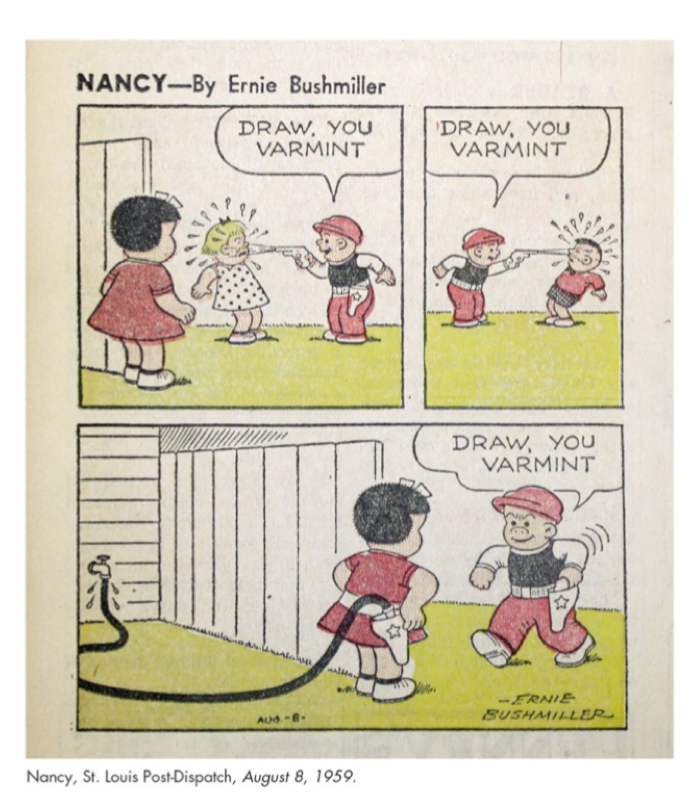
To utilize the potential of the comics page and accentuate the tension between panels and between panels in sequence and the page surface (inherent even to a grid structure) is what Kashtan refers to as “Kindle proofing” a comic. He refers to this as a nostalgic turn, a paean for dying print media rather than cast it as an embrace of an inherent modal quality to comics. He separates Lynda Barry from Matt Kindt by highlighting the fact that while Barry’s recent work is heavily designed and difficult to break into chunks, Kindt’s uses the paper quality, texture, tendency to fade, etc, to contribute to the meta-narrative, but this reads as little more than elitism. If we are to take comics as a medium, some qualities must define that medium, and as discussed above, even a comics page easily broken into panels remains a unit of storytelling unto itself. Perhaps luddite concerns are a motivation behind so-called “Kindle-proofing” but centering the argument on assumed motives rather than empirical medium-specific qualities is short-sighted. As his own discussion of Matt Kindt’s Mind MGMT demonstrates not only the use of the vertical dimension of the comics page, but the materiality of print and paper qualities as well when used as storytelling elements or embroiled in the meta-narrative. Kashtan suggests this development came about only in 2012, though he cites examples of such experiments as the four-page spread from as early as Jim Steranko’s work on 1968’s Strange Tales #167. Kashtan admits to a misleadingly dour tone in the second chapter, confessing that digitization and digital comics creation present opportunities for increased awareness of print comics’ materiality in crafting stories. My point of departure, however, is that comics are defined by that materiality. It’s not just a matter of degree, it’s the locus of the medium. Once we move to the realm of the digital, we are someplace else, someplace worth studying, but no longer in the world of comics. In chapter 3 Kashtan refers to the particular tactile experience of some web-comics; indeed web-comics offer not only animatic opportunities, but feedback opportunities, such as using a phone/tablet’s vibrate function, its speakers, etc, to augment the reading process. As haptic technologies develop, it may even become possible to mimic textural variations and create a page as screen. Despite such possibilities, however, what will result will not be a new medium because of their inclusion any more than film-scores cease to be music because they accompany motion pictures or films become not-films because of the advent of talkies. Even the precedent of live orchestras in silent theatres does not elide the fact that the medium remains intact with music or no, the same as comics will remain intact with the inclusion of pop-out elements or any other storytelling gimmick, but will not remain intact if broken into constituent storytelling units divorced from the whole. A piston is not an engine.
Cohabitation between print and digital comics is as possible and inevitable as it was for print text and e-books. Douglas Adams once described books as the shark of technologies. It’s lasted so long because it’s the best at being what it is. Kashtan’s overall argument is for a detente, a symbiotic relationship wherein digitization doesn’t necessarily compromise the medium. I would argue that it inevitably does. In Kashtan’s own words, digitization “does” something to print comics. It compartmentalizes them. This is not McCloud’s “infinite canvas” which like 3-D photography allows the reader to move in all directions on a canvas that is viewed as through the eye of a Ouija planchette. Digitization is an unstable middle ground, unsuited to either medium and compromised as a result. Digital comics, whether on the infinite canvas or created as user directed slide-shows with/without animation, sound, tactile feedback, etc, are a new medium that requires its own method of study. We must be willing to delineate between media as ComiXology are willing to delineate panels even where there are no borders, or else risk oversimplifying the branching media and story-telling possibilities at artists’ disposal.
At the risk of flogging a dead nail on the head, I gesture also towards Karin Kukkonin’s “Comics Analysis – A Basic Checklist” a handy starting point for any close reading of image-texts.
- What is the spatial layout of the page? Does the mise en page follow the classical three by three pattern [the nine-panel grid of Watchmen fame] or does it suggest an alternative reading path? How does the comic strike a balance between the ‘pregnant moments’ of the individual panels and the entire page?
- How do the characters relate to each other in the individual panels? How do their postures, gestures, and indicated movements underline the encounter? How do their bodies relate to each other across the page? What does the exchange of their deictic gazes tell you? How does this relate to the narrative?
- How do the facial expressions and the ‘pregnant moments’ of the image relate to the dialogue as it unfolds in the speech bubbles [balloons![1]]?
- How does the comic establish the storyworld?
- Does the comic present different perspectives on the events? Does it juxtapose different takes on what happens in the storyworld through the combination of panels, or the combination of words and images within a panel?
Answering most of these questions is impossible within Guided View. Juxtaposition of panels is impossible in a panel by panel presentation. This may be allayed by presenting some panels in guided view as a unified whole, but this only underscores the incommensurability of the mediums. In defining comics, the page (or canvas) must remain sacrosanct. Call else what you will, but don’t call it comics without qualification.
Perhaps this line of argument merely proves that digital comics and ComiXology’s Guided View are unsuitable for the purpose of scholarly analysis, just as a plain text version of a print book would fail as a substitute for literary analysis of a work where that analysis hinges on the materiality of the text at various points in its history, e.g. Shakespeare’s plays in folio and quarto forms, poems only available or attributed in manuscripts, etc. If we allow this, however, we are underestimating the reader. As Pauline Kael wrote of generations who have (at that point, would) grow up on movies seen on television and not in theatres, the tendency is to assume audiences in the past or future are dumber, when really the natural selection process of art has simply been obviated by capitalism meeting opportunity in the form of nigh unlimited ethereal storage space for what would otherwise molder in basements and bargain bins. No reader of digital comics (I hope) is fooled by the slick presentation of Guided View into thinking they’re getting the real McCoy (or the real McCay, as the case may be). The experience might be analogous, even pleasurable, but it doesn’t change the fact that week old room temperature camembert just ain’t the same. Even if the conseqences of resequencing are minimal as in figures 3 and 4, to argue there’s no difference is just foolish.
Finally, the future Kashtan points to of co-existence implies that Guided View’s stated goal of smoothing out the comics reading process for the neophyte is in some way desirable. Perhaps it is, to a limited extent, but Kashtan acknowledges the following:
Thus the basic problem with translating print comics into digital form is how to make comics readable without undue effort on screens that weren’t designed to display comics” (114-5).
How could they be? The undue effort is integral to the process of close reading and, I would argue, genuinely reading, any text or image-text. Ivan Rettberg has a more apt term “non-trivial” effort, which he proposes in Electronic Literature which “is required from the reader of a cybertext in order to traverse the text—and this understanding of how to move through the text must happen before any kind of interpretative reading can take place” (2). If comics are ever to completely and totally emerge from the cultural ghetto into which the artistic elite still sort the “fascist power fantasies” of costumed super-heroics, then the medium must stand its ground and demand to be treated as more than ephemeral. This can no longer be accomplished merely through curation — just as sub-par genre fiction now inundates the world of e-books as it did the world of pulps and paperbacks before. What is required is that readers be challenged, that effort be rewarded, and that enjoyment be contingent upon the success of the artist, not merely the pace, possible or actual, of ingestion. The page still matters. The print still matters. The constraints still matter. The fact that older comics are recolored for new editions should tell us that color artists have tremendous power over the presentation of the story and that materiality is paramount in criticism thereof. Even the discrepancy between print and digital evident in CMYK and RGB color values should be enough to prove that comics demand attention to the texture of the paper, the running of the inks, the mistakes, the erasures and the whiteouts, regardless of whether they are a part of an obvious meta-narrative. Those are what make comics comics.
Where do we go from here? I should hope it’s clear the answer is not to create compromised half-breeds or unduly prescribe boundaries which limit rather than define media. Kashtan is hardly wrong in suggesting the imperative towards coexistence. I merely go further in suggesting that publishers ought to invest in artists who are eager to discover the boundaries of the new medium of so-called digital comics and stake out a territory all its own while safeguarding the essential features of comics as a print medium for scholars and readers to come.
Works Cited
Benjamin, Walter, et al. Illuminations. 1st Schocken paperback ed., Schocken Books, 1969.
Cohn, Neil. The Visual Language Manifesto Restructuring the “Comics” Industry and its Ideology. Emake Productions 2007.
Borsuk, Amaranth. The Book. The MIT Press, 2018.
Groensteen, Thierry. The System of Comics. 1st ed., University Press of Mississippi, 2007.
Hatfield, Charles. Alternative Comics An Emerging Literature. 1st ed., University Press of Mississippi, 2005.
Karasik, Paul, Mark Newgarden, Jerry Lewis, and James Elkins. How to Read Nancy: The Elements of Comics in Three Easy Panels. 2017.
Kael, Pauline. “Movies on Television.” The New Yorker June 3, 1967
Kashtan, Aaron. Between Pen and Pixel: Comics, Materiality, and the Book of the Future. , 2018.
Kirchoff, Jeffrey S. J, Drew Morton, and Mike P. Cook. Perspectives on Digital Comics: Theoretical, Critical and Pedagogical Essays. Jefferson, North Carolina: McFarland & Company, Inc., Publishers, 2019
Kukkonen, Karin. Studying Comics and Graphic Novels. , 2014.
Manovich, Lev. The Language of New Media. Cambridge, Mass: MIT Press, 2010.
McCloud, Scott. Understanding Comics: The Invisible Art. HarperPerennial, 1994.
Rettberg, Scott. Electronic Literature. , 2019.
Sousanis, Nick. “The Shape of Our Thoughts: a Meditation on & in Comics.” Visual Arts Research, vol. 38, no. 1, 2012, pp. 1–10.
Stam, Robert. “The Changing Pedagogies of Adaptation Studies.” Literature/Film Quarterly, xlv, no. 2, 2017, pp. Web [n.p.].
Stam, Robert. “Beyond Fidelity: The Dialogics of Adaptation.” in Naremore, James. Film Adaption. New Brunswick, N.J: Rutgers University Press, 2000.
Tobe, Renée. “Architectural Grounding in Miller’s Elektra: Temporalityand Spatiality in the Graphic Novel.” ImageText Vol. 3 no. 1, 2006, pp. Web [n.p.].
Wershler, Darren. “Digital Comics, Circulation, and the Importance of Being Eric Sluis.” Cinema Journal, vol. 50 no. 3, 2011, p. 127-134.
Wolk, Douglas. Reading Comics: How Graphic Novels Work and What They Mean. New York: Da Capo, 2008.
[1] The work is translated from German, suggesting the translator may not be aware of scholarly conventions with regard to element nomenclature.
Of How Much Are We Certain?
Paul Hornschemeier and the Problem of Authenticity in Autobiographical Comics
Of This Much We Are Certain is a story designed to undermine the faith which undergirds all certainty in memory and narrative accounting. By foregrounding the artistic process which produced the work in question, Paul Hornschemeier invites the reader to interrogate the relationships drawn both explicitly and implicitly between narrative(s) and reality in the comics form. He accomplishes this end in a number of ways, all of which are unique to the comics form. Drawing from Charles Hatfield’s “A Comics Toolkit,” this essay will foreground the elements of image/text interplay, panel composition, layout, and style, to demonstrate Hornschemeier’s challenge to authenticity in autobiographical comics, a contradiction which Charles Hatfield describes as the “problem of authenticity” (“I Made That Whole Thing Up”).
The interplay of words and pictures, described by R.C Harvey as the most important distinguishing feature of the medium is, in the hands of autobiographical cartoonists, a means of appending a layer which both adds veracity (a picture being worth a thousand words) and falsity. Hatfield notes the unique challenge to autobiographical truth that the, inherently caricatural, art of drawing the self, layers into the otherwise non-fiction form. Hatfield compounds the assertions of Timothy Dow-Adams, whose work has largely sought to challenge the ability to write truth; narrative exigency requiring the elision of some details. Hatfield, accordingly, rejects as more authentic, the banal admissions of Harvey Pekar, because they do not address this fundamental contradiction. Hatfield puts forth Dan Clowes as a possible answer, because Clowes works, actively, to reveal the contradictions inherent in the autobiographical comics form. Hatfield calls this appeal to the very falsity of the form “ironic authentication” because it is a tactic, calculated or not, which seeks to gain the reader’s trust, even if it does so by challenging the basis of their reading of autobiography. It is into this dialogue that Hornschemeier’s story interjects.
Hornschemeier’s story sets out its dual timelines through the differentiation of the lettering style, the present (the story of the cartoonist) being lettered in block capitals, and the story of the boy being lettered in standard cursive. The assumption of any reader faced with such a difference in caption style, is to assume a divergence in the narratives, an assumption which Hornschemeier quickly challenges by having the captions seem to follow on from one another, across these timelines. In the first example, the cartoonist’s caption reads “There are simple facts that orient us in the story” with the following panel, aslant to imply it is the work in progress, bearing the caption “That this boy is running” (Hornschemeier 2.1-2). Already, the syntactic assumptions inherent in the English language have led the reader to read the captions as linked. In the next panel, the trees which abut the panel border become the balloon which houses the caption, “That the boy is running after his friend.” This narration, set above an image of the same (absent the implied friendly relationship), exemplifies the duo-specific image/text combination described by McCloud (153). This culminates in the final panel of the page, in which the cartoonist is shown in close-up, inclined toward his drawing table, beneath the caption “That the narrator is the boy” (2.5) This is the preface to the story to come, a truth claim which, as Hornschemeier’s title attests, relies on the presumption that this statement is, that it even could be, true.
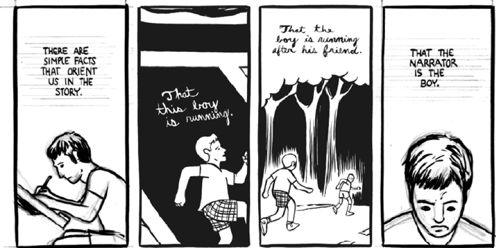
This tension is highlighted again as the story within a story is unfurled; created, if we connect its narrative to the detail shots of the inking brush which, presumably, is being used to fill in its swathes of starless sky (3.2-3). The caption to the story of the boy on 3.5 states “This story is stupid. He should stop. Why does he continue?” an answer to the prefatory anxiety of the cartoonist on page one, agonizing over what to write, that answer being, not this. In the next panel, connected, again, by syntactic assumption on the part of the reader, the cartoonist’s caption reads “But he cannot die. We are reminded, as the boy is the narrator.” The implication is that the story cannot be abandoned, that it has been set in motion, that it, like the fall at the story’s climax, is not predestined so much as in progress. The only “certainty,” and here Hornschemeier plays with the reader’s assumptions about storytelling, is that three of the eight pages of a story are not going to be dedicated to an aborted tangent.
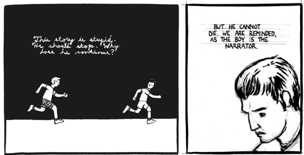
Later in the story, the picture plane itself is brought into tension with the image/text interplay. From the beginning 1.4, the reader has been directed to regard the story of the boy as the product of the cartoonist, evidenced by the drawing table, the page in progress, and the inking brush from 1.6 which the cartoonist, presumably, holds in 2.2. In 2.3, the panel borders of the comic and the comic within a comic diverge, the panel within a panel drawn at a slant to imply the surface of the drawing table as distinct from the picture plane of the page, an example of the tension between “narrative sequence and page surface” (“An Art of Tensions” 1).
On page two, this divergence is still reinforcing the presumed difference between the boy and the cartoonist which is then called into question by the caption in 2.5. In 5.3 and 5.4, the reader’s presumption is, again, played with. 5.3 shows a closeup of a shoe against a matte background, the implication being that this is the night sky to follow along with the boy’s story. In 5.4, the panel, again, diverges from the meta-panel, and the camera seems to have shifted, revealing the previous panel to have been a closeup view of this larger panel. What was a shoe floating in space for all the reader knows, is now revealed to be only inches above the ground, the boy, not levitating, but captured mid-stride. The caption reads “How will you know you are right side up?” a question which, if we take the previous panel into account, can only be answered with uncertainty. The next panel challenges this one, the cartoonist, consulting a book and producing, the caption implies, the scientific answer that “you will know you are upright by the semicircular canals in the inner ear” (5.5). The contrary conclusions, the collision between the uncertainty of position and the “certainty” of scientific conjecture, is underscored by the fact that the cartoonist is viewed in opposing profile to the boy who is running right towards him.
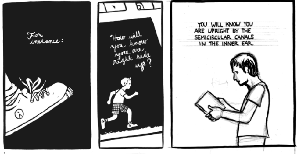
This same interplay is brought to the fore on page six. The first tier is divided in four, each version of the cartoonist varied not only by the seeming lack of connection between their actions, but by their changed clothing. Contrasted with the captions “But this change in position of fluid will take time./And to register that change will take time./And for that time you will not know where you are./But you will assume that you know” this montage evokes not only the unique ability of comics to relate space to time (to borrow McCloud’s borrowing from Will Eisner) but also the inherent assumptions which readers make about continuity and causality between adjacent panels, a tendency McCloud calls “closure” (67).
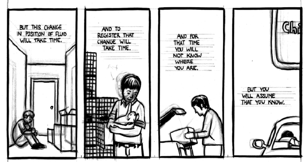
The gradual blending of the timelines through the image/text interplay is set against the more definitive division between panel compositions. The heavy blacks of the night against which the story of the boy plays out are juxtaposed with the unshaded line art of the figures and the polished contours, particularly the geometric frame of the house, devoid of perspective like the prototypical rendering of a child artist (2.3 and 5).
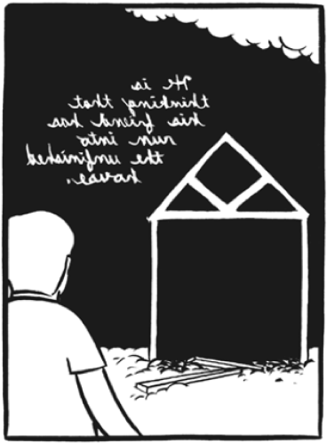

This image is almost a negative to the positive of the cartoonist’s timeline, likewise un-shadowed, but with the addition of un-inked areas that evoke the effect of high key lighting blowing out patches of the cartoonist’s hair (4.1, 4, and 9). This inversion of the monochrome is the primary way in which the timelines are differentiated until the final two pages which detail the accident, at the moment of, and after which, the boy’s timeline, even before the shift to day, is suddenly illuminated (7.4-7 and 8.1-3).
Even in those final pages, however, the linework in the boy’s timeline is cleaner, if only because Hornschemeier doesn’t give the impression, as he does in the cartoonist’s timeline, of the art being unfinished. Throughout the story, the cartoonist’s timeline is indicated by the inclusion of grey pencil lines alongside the black ink lines, often accompanied by penciled comments, including “push back a bit” (8.4), and the stenciled ruling lines which the cartoonist’s panels are lettered against. This effect draws attention to the crafted nature of the cartoonist’s timeline, just as the narrative draws attention to the crafted nature of the boy’s story through references to the cartoonist’s profession. The reader is prevented from dismissing this stylistic choice as a comic rushed to completion, however, because some of the penciled comments, including “fix” (1.4 and 8.7) refer to uneven ink lines, a latter step in the artistic process.

The layout of the story is in tiers of three, with the exception of the title page which dedicates the first two tiers to a larger panel showing the spot-lit inner ear suspended over a puddle of shadow? Blood? Ink? We cannot be certain (2.1). This surreal deviation from the “real” of the comic and comic within the comic is repeated in the pan shot that comprises the third tier of page seven, showing a substance rendered identically to the puddle beneath the floating cochlea, suggesting blood to complete the arrested fall of the panel before and the stain on the boy’s shirt on the first panel of the following page, but also suggesting the ink with which it is drawn and which fills the bottle which the cartoonist closes in 8.5, the first tier in the present timeline which follows the pan shot. These two deviations, 2.1 and 7.5-7, and the repetition of the giant cochlea in 6.6 are, tellingly, also the most abstract moments in the story, the moments which cannot possibly have been witnessed by either the boy or the cartoonist, the former because it features a giant cochlea. Incidentally, the cochlea is the only object in the story with value shading to emphasize its contours, besides that contributed by the un-erased pencil lines in the present timeline, making it both the most realistic and the most absurd rendering in the story. The latter is abstract because the boy is, presumably, unconscious. The lettering precludes this being a present closeup of ink, except in the metatextual sense.
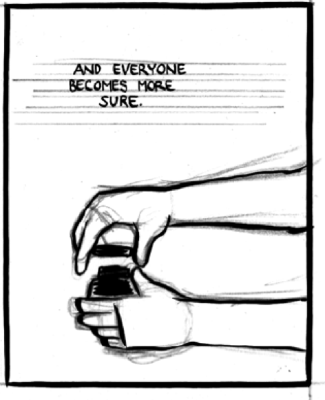
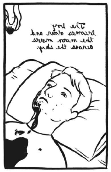

Certainty, Hornschemeier seems to suggest, is a product of presumption. Just as abstract comics become comics largely because of the introduction of customary features of the medium, regardless of what is drawn in the panels, so, too, is certainty in storytelling undermined when the reader is forced to interrogate the assumptions that are an integral part of the process of reading comics (Groensteen). If the reader cannot rely on the relationship (any relationship) between words in prose, or between panels in comics, then the contract is shattered. If the reader cannot know that the cartoonist is the boy and vice versa, then the timelines which are so painstakingly laid out, blend. This is true at another level, between the cartoonist and Hornschemeier himself, whose avatar the cartoonist, ostensibly, is. Certainty is only achievable, in autobiographical comics at least, through a litany of unstable presumptions which constitute an additional wrinkle in Hatfield’s “problem of authenticity.”
Works Cited
Eisner, Will. Comics and Sequential Art: Principles and Practices from the Legendary Cartoonist. W.W. Norton, 2008.
Groensteen, Thierry. “Comics and the Test of Abstraction.” Comics and Narration. University Press of Mississippi, 2013.
Harvey, Robert C. “Slouching Towards an Aesthetic.” The Art of the Comic Book: An Aesthetic History. First ed., University Press of Mississippi, 1996.
Hatfield, Charles. “An Art of Tensions.” A Comics Studies Reader, edited by Jeet Heer and Kent Worcester University Press of Mississippi, 2009, pp. 132-48
Hatfield, Charles. “I Made That Whole Thing Up.” Alternative Comics: An Emerging Literature. First ed., University Press of Mississippi, 2005.
Hatfield, Charles. “A Comics Toolkit: Formalist Perspectives.” Handout. California State University, Northridge. Los Angeles. n.d. PDF.
Hornschemeier, Paul. “Of This Much We Are Certain.” Autobiographix, edited by Diana Schutz 1st ed., Dark Horse Books, 2003.
McCloud, Scott. Understanding Comics: [the Invisible Art]. 1st Harper Perennial ed., Harper Perennial, 1994.
Illustration as Translation in Mary Shelley’s Frankenstein
Dustin Prisley
ENG 507 Romanticism and Translation
Profs Beer and Hunt
March 23, 2019
Illustration as Translation in Mary Shelley’s Frankenstein
At the intersection of romanticism and translation is Mary Shelley’s Frankenstein, itself the epochal novel of the Romantic Period, and often subtitled as such, most notably in its first stage production. The novel is intimately tied to the works from which it draws, perhaps most prominently, Coleridge’s Rime of the Ancient Mariner, the Dore illustrations to which inspired Bernie Wrightson’s illustrations to the novel, close readings of which form the crux of this essay. [MOU1] The question this paper seeks to address, in the vein of a number of works which address what Shane Denson terms the “plurimedial” nature of serial texts [MOU2] (532). Denson applies this moniker to works which, like Frankenstein, have long afterlives across various media, such as Sherlock Holmes, and which accrue “non-diegetic[MOU3] ” attributes from each iteration, creating, in effect, a canonicity that includes, but is far from dependent upon the original text[MOU4] s. I approach Denson’s arguments as they pertain, specifically, to a reading of Frankenstein, in translation through illustration and comics adaptation, two forms which rely upon the interaction of words and pictures to create an impression of the novel which is mediated by the imaginative reception of the text, or its afterlives, by the illustrator or cartoonist. This essay will begin [MOU5] by discussing, generally, the history of illustration of the novel and adaptations into the medium of comics and will then segue into a discussion of two particular projects, the illustrations of Bernie Wrightson to an edition of the novel published first by Marvel in the 1980s, and re-issued by Dark Horse Books in 2008, and an issue of The Crypt of Terror, in which Al Feldstein (writing) and Jack Davis (Penciling) relay an iteration of the Frankenstein story. Throughout, I will gesture also to translation of the novel in general and to some of the multifarious adaptations which have contributed to the textual afterlives of Mary Shelley’s masterpiece, including her own additions and emendations which, in the 1832 edition, significantly altered the meaning and influenced the interpretation of the text with the presumption of authorial authority but which, as with all such projects, amounts also to a project of translation.[MOU6]
The project of cataloguing the history of illustration of Frankenstein, as well as adaptations and translations has largely been undergone, and interested readers are advised to turn to those authors cited for more exhaustive accounts[MOU7] . It suffices, here, to provide a few illustrative examples and provide a broad overview, to the end of enlightening the forthcoming discussion of illustration as translation. Emily Alder notes that the first translation of the 1818 text was into French in 1821, just two years before Richard Brinsley Peake’s 1823 stage adaptation Presumption; or, the Fate of Frankenstein (210).
The first illustrated edition dates to 1831 which was a part of the Henry Colburn, and Richard Bentley Standard Novels Series, its ninth publication, and the third edition of the novel (Moreno and Moreno 228). It was illustrated by Van Holst, a pupil of Fuseli whose paintings had an impact on Shelley’s composition, and whose frontispiece is illustrative of his approach, in that his creature is comely and decidedly un-Karloff-ian, and looks bewildered, surrounded by Gothic detritus, as Victor flees his chamber in disgust (Fig. 1). As Moreno and Moreno note, too, this first illustrated edition did much to counteract the trend, which would become prominent in dramatic revivals of Shelley’s tale, to create the countercurrent [MOU8] in artistic trends of depicting the monster as more Adam-like and less like the green grotesquerie of Peake’s play (231).
Another intriguing instance is the 1897 London and Philadelphia edition of the novel which featured no portrayals of characters in the novel at all, only a collection of landscapes[MOU9] , suggesting the uniquely (R)omantic nature of the text with its own lengthy digressions into Shelley’s travel diaries and quotations of picturesque poetry, and choosing, rather than to render the instances themselves, to juxtapose them with countervailing images in what Scott McCloud in Understanding Comics, would refer to as “Parallel” in which image and text are not, at least in the perception of the frame, related[MOU10] to one another[MOU11] (154).
The De Luxe Edition of 1932, illustrated by Nino Carbé, takes influence from Murnau’s Nosferatu, and portrays the creature as something more vampiric, showing the influence not only of the Universal monster films featuring the creature, but also the vogue for vampirism that was encapsulated by the popularity of Lugosi’s portrayal of Count Dracula (Moreno and Moreno 232). Lynd Ward’s 1934 woodcuts are a standby for critical exploration of the illustrative tradition of Frankenstein, and are executed in woodcuts (Moreno and Moreno 234). Notably Ward includes an albatross in his illustration accompanying Walton’s quotation of Coleridge, thus undergirding the intertextuality of Shelley’s text, and his images also comment notably on the story by providing visual cues to later events, including using caricature of the judges in Justine Mortiz’s case as “grotesque and simian” to suggest the imminent outcome (Moreno and Moreno 234).
Finally, the 1968 Cercel des Bibliophiles edition published in Geneva, notably introduced by a film critic rather than a literary critic in a nod to the “pluritextuality” which by this point had allowed Boris Karloff with his flat head and neck bolts to supplant the “original.” It is illustrated by Christian Broutin, who, as the Morenos note, includes Shelley as a lurking figure in his illustrations alongside the monster, evoking the ‘hideous phantasm’ of the preface to the 1831 edition, that inspired the tale, pointing also to the idea of Shelley as a presence in the text (interfering with and changing it, as she did in 1831), which could, in some ways, be considered tampering in the mode of her ill-fated Frankenstein, or even be seen as a kind of self-translation, with all of the implicit pitfalls of that act[MOU12] (235).
In sum, as Paul O’Flinn conjectures, there is no definitive version of Frankenstein [MOU13] and its myriad adaptations have, as echoed in Denson, precipitated a “literal rewriting [..] as novel becomes script becomes film” becomes illustration, becomes comic, as this essay will expound (194-5). Even as early as Peake’s 1823 play, Shelley began to feel that “the notoriety of the story owed as much to Peake’s stage adaptation as to the text itself, if not more” (O’Flinn 201). This could, of course, send one down a rabbit hole of deconstructionist argumentation, but I argue, along with O’Flinn and Denson, that the very fact of Frankenstein’s appropriation makes questions of originality of the text hard to argue[MOU14] , particularly if one measures the worth of a literary work by its influence, as indeed, there can be no objective assessment of quality, and influence is required to even grace the desks of readers who might lend a work a stamp of quality. In essence, adaptation must, at least in a sense, be seen as a kind of translation, with the Karloff films as valid an entry in the ‘canon’ of Frankenstein as the film, just as Shelley’s 1831 edition was undoubtedly fed by Peake’s play, making the question of the original, even in Shelley’s lifetime, a thicket. [MOU15] O’Flinn argues that emending the text in 1831 to renounce Elizabeth’s status as Victor’s cousin is as much an act of translation, not between but within a language, as later versions increasingly confusing, or translating entirely, the creature into the creator, as the creature usurps the name of Frankenstein in most popular media (202).
By way of example, O’Flinn cites Bertholt Brecht, who often revised his plays depending on the context in which they were performed, with the production of Galileo that followed close on the heels of the nuclear holocaust visited upon Hiroshima and Nagasaki, being coloured by those events, casting the father of physics’ life in a new light, and, to Brecht required staging (illustration, if you will) which could highlight this context and lend the production not only the aura of timeliness, but also acknowledge Brecht’s belief that theatre must imitate reality to have import.
Even during the composition of the novel, Shelley was deeply affected by news of Luddite uprisings and retributions (O’Flinn 197). Percy Shelley wrote a pamphlet which Mary notes she read in her diary, called An Address to the People on the Death of Princes Charlotte from November 1817 lamenting the ‘national calamity’ of a country torn between revolt and the vengeful despotism of the government response, which Percy Shelley characterized as ‘the alternatives of anarchy and oppression’ a stance which echoes strongly his response to the 1819 Peterloo massacre, in Masque of Anarchy (O’Flinn 199). O’Flinn notes a number of textual occasions wherein Shelley was responding, directly or indirectly, to these political contexts, much like Brecht, and so it seems only natural that her emendations in response to the changing politics of 1831 Britain as opposed to that of 1818, no less than her own evolution in her political thought, should be thought as much an act of translation as Brecht restaging or rewriting to complement his own historical context. [MOU16]
To return to illustration, another example, and one which hews closely to the quality of Wrightson’s work which I will explore later, the 1984 Pennyroyal edition of the novel, like Ward’s, uses the medium of woodcut illustration, again with the intention of mediating the interpretation of the text through its juxtaposition with his images (Bukaman 192). The most notable choice therein, is that his accompaniments to the chapters narrated by the creature, seven images in total, are a succession of increasingly magnified views of the creature’s face set against a matte black background (Bukatman 204). Of further interest, still, is the fact that these seven images are the only ones printed in colour in the entire volume, and this merely a tinge of gold which, Bukatman argues, suggests the fire between the creature and the creator hearing the tale, the reiteration driving home Moser’s interpretation that the only thing which separates man from monster is this fire, this Promethean gift (204). Moser also, quite intriguingly, gives over the final image to the face of the creature in death, effectively giving it not only the final speech, but the final image in the text, signaling the side which the illustrator has taken[MOU17] , even if it does “mis-translate” the stated intentions of Mary Shelley herself (Bukatman 205).
Translating through illustration, much like adapting into film, implies not only the change of media, but also of audience[MOU18] . As O’Flinn notes of the adaptation of a Gothic novel pitched to the emergent middle class whose genre the novel was, into the film, which by the 1930s was the common media of the people, a proletarian art or entertainment is a kind of translation of itself. By the same token, the illustrated novel, generally produced at a much higher cost than the pulps of the 1950s whose content aped so much of the Gothic aesthetic and character and costlier too than cheaply produced paperbacks, even today, suggest that it is pitched, like the novel of Shelley’s time, to an audience with disposable income, and, by extrapolation, education. [MOU19] Illustration is a prestige format extended, even today, primarily to expensive works and towards an audience that can afford them, with even children’s books that have scarcely more than 20 pages, costing more than an average hourly wage. This is by comparison to comics, like film a historically proletarian medium, which I will extrapolate upon below.
In translating a ‘horror’ novel, to run the risk of assigning Frankenstein a genre, one must consider the effect which must be produced by the work to affect its ends. Scott Bukatman makes the argument that neither illustration nor comic should have the capacity to scare, because the reader is in control of the pace at which the images are presented to them and can escape the experience entirely with a mere fluttering of the eyelids (191). This is distinct from film, which presents the images in the sequence and at the exact time the director (or editor) wishes, and which, even if one closes one’s eyes, subjects us still to the sound of what we fear to look upon. The same, too, is true of theatre, where the performers, and the director, again control the pace of the action and what the audience “sees” at any given moment. Bukatman concedes, however, that the novel (which can also be shut out and the pace of intake of which is controlled by the reader) can couch the horrific in language which leads one unexpectedly (as in the case of Shelley’s florid prose giving way to linguistic renditions of charnel houses and exhumed remains) to dawning horror. Illustrations, assuming they accompany and represent the text they illustrate, and comics especially, have the “disadvantage” of being taken in as a whole before being read sequentially, such that the reveal, two panels, or even a page away, is spoiled the moment the reader turns the page, such that only by hiding the reveal behind a page flip can the cartoonist conceal the horrific moment.
And yet, the comic, at least in the 1950s with the prominence of EC (Entertaining Comics – changed from the publisher’s father’s corporation, Educational Comics), most notably its horror titles, including Crypt of Terror, an issue of which I discuss below, and since the 1980s with the publication of the influential Alan Moore, Steve Bissett, John Totleben, and Rick Veitch run on Swamp Thing (taken over from Bernie Wrightson penciling scripts by Len Wein) was the principle medium for horror content. Bukatman sheds some light on this seeming paradox, arguing that illustration, and comics in particular, have the strength of fascinating the reader, allowing them, unlike the frame in a film which is replaced by another in less than 1/24th of a second, to linger over the image and to take in detail at their own pace, much like the text of the novel. As he puts it
the reader encounters a particularly striking, startling or even shocking image or image sequence in the course of reading, and moves on. Until she doesn’t. The page that is turned can also be turned back, to look again. And again. And, tomorrow, again. A picture can be very haunting (especially for a kid who isn’t yet allowed to watch horror movies, or in the days before home and streaming video made cinema perhaps overly accessible). Ostensibly depictive, a picture can play with shadows and light, hiding and revelation. An image might even dare a reader/viewer to confront it again, the challenge being to somehow master the feelings it stimulates. One could say that images in books and comics do more than haunt, they lurk between the pages, waiting to emerge and re-emerge. (191)
This[MOU20] applies equally to comics as to illustration, and, though Bukatman argues comics are closer to cinema in keeping images moving constantly before the eye, his reasoning here seems specious. In comics, as McCloud talks about in the chapter on the “gutter” or the space between panels of a comic, this gap creates a space in which the action between the panels can occur, such that a man with an axe in one panel, who, by the next is holding a severed head, leaves no doubt as to what has occurred. This is akin to Bukatman’s argument that illustrations in a book “punctuate” the text, approximating a game of hide and seek analogous to the jump scare in a film (192). In both cases, the addition is clearly, if not necessarily to the benefit, then certainly to the augmentation of the story [MOU21] even if it is as strictly “faithful” like one of the many Classics Illustrated comics titles marketed as introductions to works of classical literature on par with the Romantic endeavor of Charles and Mary Lamb to introduce young readers to the tales of Shakespeare[1]. In doing so, this act of translating, abridging being another term, or otherwise adapting the earlier work, the new author or illustrator or cartoonist creates a version in canon with the original, though perhaps no more or less legitimate[MOU22] than that original. Bukatman refers to a story in Mike Mignola’s Hellboy series which incorporates the creature as a character and which takes place in the fictional continuity, before the novel was even written and he says that “Comics once more turn the novel into another, rather than the first, iteration of the monster’s story” (201). A Marvel comics story Denson remarks upon has the X-men squaring off against a creature whom professor X asserts was the model for that in the novel. It may then seem absurd to counter the “original” 1818 text with versions patently created later and influenced by it, but from a critical standpoint, it is no more ludicrous than the acknowledgement of influence generally, and Mary Shelley’s tale of a “hideous phantasm” compelling her to set its visage into text.[MOU23]
Emily Alder offers another intriguing perspective on the translation of Frankenstein into later, particularly illustrated texts, taking for her prime example, a children’s picture book entitled Do Not Build a Frankenstein!. Alder suggests that, much like the Lamb’s Tales from Shakespeare, Frankenstein can be used as a textual referent in books for younger readers: “if writing in Gothic modes can offer, shape, or negotiate new constructions of childhood that understand both child characters and implied child readers as sophisticated, capable, critical, and knowing, so too can graphic novels and picturebooks, because graphic narratives communicate in different ways from text-only narratives, their forms offer some unique opportunities of escape from traditional conventions or expectations” (213). In this example, Alder’s representative text tells the story of a little boy who has created the creature as a playmate and its appearance is closely modeled on the monster of Whale’s film. The text, as Alder presents it, “relies on awareness or prior knowledge of an originating story to exploit readers’ expectations, a trick dependent on pictures, words, and the material form of the book itself (215).” The title pages show children running away from something underneath the foreboding title itself, suggesting how the story will unfold, and, indeed, the Victor character has moved to a new town and school to escape it, explaining to his classmates, like the novel’s Victor does to Walton, what he has done. The pictures contradict the words of the text, however, showing the creature, “misunderstood and playful” unintentionally terrifying Victor in the night, breaking his toys, and scaring his friends (216). By the story’s close, as Alder notes, the title page has assumed a new context, as it is revealed the children are playing tag with the creature rather than fleeing its rage (216). McCloud would call this an example of “inter-dependent” comics communication, in which neither word nor image can convey the whole idea by themselves, and the book, in addition to relying on some prior knowledge of the story being subverted, exercises its point by having the words and pictures in semi-opposition to one another, much as one could imagine an illustrated Frankenstein, like Van Holst’s in which the creature isn’t ghastly in the slightest, creating tension with the text as written and changing, or translating the story.[MOU24]
Within the text itself, the creature presents itself as lost in translation, unable to impress upon viewers the wholeness of his human character[MOU25] . He is a glyph which the sighted cannot abide long enough to see translated, creating a tension wherein the monster, even narrating his own story, is, in fact, narrated by Victor to Walton and, in turn, by Walton, to his sister, or the reader. As Diedrich says, “all of the monster’s interlocutors–including, finally, the reader–must come to terms with this contradiction between the verbal and visual” [MOU26] (404). This feeds further into Denson’s claims that “non-diegetic traces of previous incarnations accumulate on such characters, allowing them to move between and reflect upon medial forms, never wholly contained in a given diegetic world” (531). Just as the monster is unable to proceed into the world, nor is anyone, really, without being prejudged based on his appearance, so, too, is a reader, even in Shelley’s lifetime, incapable of approaching the text without the weight of “non-diegetic” traits creeping into their assessments, try how the new critics might.[MOU27]
Which brings me to Bernie Wrightson[MOU28] . Having approached the task of illustrating Shelley’s novel as a passion project in his spare time over many years as a successful penciller and inker of monthly comics, his stated aim was to produce illustrations unencumbered by the other visual, particularly filmic, adaptations of the text. He stated “ I loved the movie interpretation and I’ve been fascinated with that story ever since” however, as Wrightson admitted in an interview, cited by the Morenos, “When I was a little older, I read the book by Mary Wollstonecraft Shelley and wondered why they never put all that great stuff into a movie” (236-8). Wrightson’s illustrations, in the Morenos’ words, “reveal sublime isolation and melancholic solitude” reflecting the influence of Romanticism as embodied by the Caspar David Friedrich painting The Wanderer Above the Sea of Fog, which has graced the cover of more than one edition of the novel (238). Wrightson’s illustrations, executed in pen and ink, reproduce in exacting detail the quality of pristine woodcuts, with hatching and value work heavily indebted to the woodcuts Gustav Dore executed for The Rime of the Ancient Mariner (Richardson).
Turning to the endpapers for the Dark Horse reissue of Wrightson’s edition of the novel, the first character encountered is the creature surrounded by forest, his face pensive, suggesting we have encountered him during his sojourn with the Delaceys. The cover, too, bears a detail shaped like a Victorian miniature, of the final illustration, before the rear endpapers, of the creature following Victor’s demise. Both signal, from the outset, that the attention in this, as in many versions of the tale, will be upon the creature, rather than upon Victor. The illustrated title page is of a graveyard bedecked with angels, eyes uplifted, and grasping cherubim, with the author credits placarded to a headstone topped with a down-looking skull wearing a crown of thorns, suggesting a desiccated Christ. The first illustration accompanying the text shows Walton standing amongst the rigging of his ship, the sky hatched to suggest clouds just as in a woodblock, with delicate curving linework shading the sails. In a way, the image seems to be a reverse perspective of Friedrich’s famous painting. Only Walton’s face is aglow with the light piercing the clouds, his long hair blowing in the wind and his solitary figure clearly evoking the romantic solitary of Friedrich’s ideal (Shelley and Wrightson 10)
Wrightson’s illustrations often rely on scale for their effect. In his rendition of the scene captioned “I beheld a stream of fire issue from an old and beautiful oak…” (37). Victor is dwarfed not only by the phantom image of the tree beyond the door he holds ajar which is awash in firelight or lightning glow, but by the house itself. The doors are three times his height and the adjacent draperies are drawn shut. The ceiling is beyond the frame as even the semicircular glass window which caps the threshold is cut off, its spider-web patterned glass suggesting its design was inspired by shattering, by the picturesque aesthetic of follies painted by Fuseli, and landscape architecture a la Capability Brown, with its delight in the “ruined.”
The lecture hall in which Victor is subjected to “a recapitulation of the history of chemistry” is similarly Brobdingnagian with only four students in view, outnumbered by the engraved faces of the great scientists which adorn the bottom of the wooden lecture seating (43). The professor, back turned to the viewer, holds the book behind him, orating from memory, evidently, standing beside a small assortment of vials and lab equipment, but with his hand set upon much thumbed tomes, bookmarks protruding, suggesting the distaste Victor will feel for this impractical method of teaching the natural sciences. Most of the laboratory equipment is arrayed along the top of the pews beneath the tall banks of windows which are slatted in geometric patterns, curves, squares, and rectangles, indicating the dominance of rationality and science in this hall of learning, as opposed to the romantic and the picturesque of Victor’s home.
By comparison, Victor’s apartments are littered with equipment, with glassware and practical instruments, but the books, with the exception of the one in which he is writing in Wrightson’s illustration, are bundled, tied, clasped, or stacked beneath such instruments (49). This is the laboratory of a practical man, in which his laid-back posture, feet extended beneath the cluttered dining table, suggests a bizarre ease in the presence of a coffined skeleton and a skull ornamentally displayed on an adjacent shelf, harbingers of the work Frankenstein will soon undergo.
Wrightson’s first illustration of the creature bears a skull in the upper left, capping a long piece of laboratory glassware, looking down upon the creation like a spectre of death (59). The creature grimaces, its lips drawn back from two rows of neat white teeth, its hair hanging in thin strands from its head, its face chiseled to the ideal of human perfection with nary an ounce of fat to be found. Its nose, however, is receded, skull-like, suggesting Wrightson’s creation for comics, the Swamp Thing, and its muscled form is uncanny, every sinew drawn taught, forcing the veins to the surface like a body-builder’s as it grips the railing of its coffin with an unnaturally bulky hand. The image is captioned “… I had selected his features as beautiful.”
In the scene of their meeting on the mountaintop, Wrightson’s Victor and the creature take up only the top third of the composition, with semi-horizontal hatching on the sky beyond suggesting the extreme wind which billows their clothes (104). Victor holds a staff before him in protection against the towering creature whose face appears like a hollowed skull, impassive like the personification of death, sans scythe, arms at its sides. The rest of the composition is taken up with the surface of the glacier or mountain, with the crags which might be crevasses waiting to swallow creator and created alike.
The scene of the creature’s first glimpse of itself in the pool shows no reflection in the hatched surface of the river as the monster’s huge forearm enwraps a boulder as though for dear life and leans upon the other, its face downcast, eyes closed in evident dismay at what it has glimpsed. It’s black cloaked form bleeds into the surrounding moonlit foliage (125). The creature’s affectation is almost effete in the scene where it peers through the chink in the Delacey’s wall, it’s right hand coiled in the semblance of a gesticulation as its brawny left arm holds it upright and its thin lips curve ever so slightly upward in a show of peace as its hair hangs damply from its forehead and its eyes, white in the glow of the Delacey’s hearth-fire seem expectant and hopeful, its legs splayed in girlish delight at the possibilities of what, by rights, is the creature’s adolescence (131). Finally, in the closing end-papers, Wrightson shows the wave wracked sea bleeding almost indiscernibly into the ice floe where the creature, now arrayed in fur lined clothes that all but hide his inhumanity, save his massive hand and cape wrapped face (even its hair is combed to appear somewhat dapper) looks down at its shadow as Walton’s ship crosses the white horizon.
All of these illustrations, though I have selected only a few, suggest the task Wrightson undertook as illustrator, as translator. Not only has this edition notably left out either of Shelley’s prefaces, though the first is likely the product of her husband’s pen and replaced them with an introduction by Stephen King, Wrightson has also foregrounded the creature as the hero of the text, like Moser, giving it the last visuals, and also the first visual, as well as the final words, though they are mediated through Walton. It is no accident, to say the least, and Wrightson was fully aware of the tradition into which he stepped, coloured, if not in his visual approach, then certainly in his narrative allegiance to the creature who had been the highlight of the film that first drew him to the novel, just as the green grotesque of Peake’s play attracted many readers to Shelley’s novel when the theatre was the proletarian art and the novel the prestige form to which the lower middle and lower classes aspired.[MOU29]
Finally, I turn briefly to The Crypt of Terror, issue 34, in which the first story, following the traditional introduction by the eponymous Cryptkeeper, follows the reader, “you” rather, as “you” wake in the laboratory of a mad scientist, finding yourself bound, and in which “you” as the captions attest, escape the laboratory, find yourself in the center of town where the townspeople, gathered to enter the theme-park-cum-carnival which “you” later discover is the front for the laboratory of the scientist who has created you in the likeness of Frankenstein’s monster, reanimating your corpse after you died of a heart attack in the house of horrors attraction, from fright, evidently. The story, written by Al Feldstein and penciled by Jack Davis of Mad fame, also published by EC, is not a strict adaptation of Shelley’s story, but is a retelling with clear reference to that original tale, much like the Marvel comics which Denson examines in his essay. Davis’ creature is well within the Karloff mold, complete with flat head, hair, and protruding bolts. The story diverges, however, in the fact that the creature has memories of a previous life, even stealing a car after inadvertently strangling its frightened driver, and driving to its erstwhile home where its wife, not recognizing the reanimated corpse of her beloved, flees and ultimately falls from a window as she attempts to escape, dashing herself against the concrete patio below. The creature then returns to the lab where its decidedly un-Frankensteinian creator had hailed its reanimation as a triumph and where it is greeted in with open arms. It strangles the madman and wanders back into the wax museum of horrors, finding itself, “yourself” rather, confronted by a tableau of the monster of Shelley’s creation which turns out to be a mirror. Finally, “you” flee the renewed mob into a house of mirrors where the sight of your own reflection at every turn drives you mad and, ultimately, kills you, as the horrors of the wax museum killed your previous self. The hag-like Cryptkeeper intrudes at the end of the tale to comment with a pun on the idiom “if looks could kill” and admonishes “you” the reader, illusion broken that you were, in reality, the creature of this tale, not to look into a mirror for fear of what you might see.
There are many layers to this story, only eight pages as was typical of stories in EC magazines, and as Alder read into a children’s book, much can be read into this comic with its dependence, not only upon familiarity with the “original” story of Frankenstein, as referenced in the comic, but also with the various film adaptations. The comic is as intertextual as Shelley’s novel, though its referents are different. The conceit, too, of placing the reader in the position of the creation signals a translation of Shelley’s novel, too, in that it takes the sympathy with the creature to an even greater extreme[MOU30] , not only asking you to rectify the contradiction between verbal and visual which Diedrich highlights, but asking you to embody it. The story denies you, for the most part, the experience of witnessing the monstrosity of “you” the creature, except through the eyes of those who fear and shun you, forcing you into the position of the creature in the novel, [MOU31] while also removing the dual layers of abstracting narrative which couch the creature’s autobiography in Shelley’s text. Davis and Feldstein pare down the story to its essentials[MOU32] , taking the same tack as Wrightson and countless others, including the artists behind Do Not Build a Frankenstein! and refuse to simply narrate the experience of the creature in the reflecting pool by simulating it with a mirror, inviting the reader not to read it but to experience it, to experience the sensation of, Eve-like, gazing at one’s reflection and not recognizing it, though this is mixed in with the memories of a prior life which “you” have in the story.
Ultimately, the question of what constitutes an act of translation, if we accept the possibility of such within a language, is open ended. I would argue, however, that the fact of stories being “interpreted” by any given reader, suggests that language is always an act of attempted communication subject, as the creature is, to being misjudged on sight. In essence, any failure of communication is, ipso facto, a failure of translation. Frankenstein epitomizes the romantic novel in its intertextual gestures to contemporary works and themes, and in its encapsulation of many of the aesthetics, whether original or accrued, which the modern reader ascribes to Romanticism as such. Illustration and adaptation into comics are only two ways in which the story has penetrated subsequent culture and are, I argue, illustrative of the story’s supreme adaptability to different contexts. If for no other reason than the eternal question of what is the “original” Frankenstein, as scholars to this day debate the degree to which Percy Shelley contributed to, edited, or emended his wife’s text, leaves the work in a limbo which epitomizes the “plurimedial” quality Denson points to in Frankenstein and other habitually adapted works. Wrightson’s illustrations are not unique in their approach to the text as itself, eschewing prefaces (though a new introduction was added for the Dark Horse release) and aesthetic qualities borrowed from the popular films, but they do highlight a quality in illustration, of this text in particular, wherein illustrations not only render the text into image, but also implicitly take sides in the conflicts depicted[MOU33] , giving extra-textual voice to certain characters that doesn’t adapt, so much as translate, the “original.”
Fig. 1
Works Cited
Alder, Emily. “Our Progeny’s Monsters: Frankenstein Retold for Children in Picturebooks and Graphic Novels.” Global Frankenstein, edited by Carol Margaret Davidson and Marie Mulvey-Roberts, Palgrave MacMillan, 2018, pp. 209-226
Bukatman, Scott. “Frankenstein and the Peculiar Power of the Comics.” Global Frankenstein, edited by Carol Margaret Davidson and Marie Mulvey-Roberts, Palgrave MacMillan, 2018, pp. 185-208
Davison, Carol Margaret, and Mulvey-Roberts, Marie. Global Frankenstein. Palgrave Macmillan, 2018.
Denson, Shane. “Marvel Comics’ Frankenstein: A Case Study in the Media of Serial Figures.” Amerikastudien / American Studies, vol. 56, no. 4, 2011, pp. 531-553.
Diedrich, Lisa. “Being-Becoming-Monster: Mirrors and Mirroring in Graphic Frankenstein Narratives.” Literature and Medicine, vol. 36, no. 2, 2018, pp. 388–411.
Moreno, Beatriz González, and Fernando González Moreno. “Beyond the Filthy Form: Illustrating Mary Shelley’s Frankenstein.” Global Frankenstein, edited by Carol Margaret Davidson and Marie Mulvey-Roberts, Palgrave MacMillan, 2018, pp. 227-243
O’Flinn, Paul. “Production and Reproduction: The Case of “Frankenstein.” Literature and History, vol. 9 no. 2, 1983, pp. 194-213
Richardson, MikePersonal Interview. 27 February, 2019.
Shelley, Mary Wollstonecraft, et al. Frankenstein, or, The Modern Prometheus. 1st ed., Dark Horse Books, 2008.
[1] In the interest of fully representing Bukatman’s thoughts on comics as a medium particularly for the translation, adaptation, or continuation of Frankenstein, I provide the following extended quotation. “If there is as perfect an equivalent in comics, one that exemplifies something fundamental about the medium, I have yet to find it. But perhaps that’s the point: perhaps no single text speaks to the uncontainable variation of comics. The medium not only combines word and image but pictorialised words and legible images. The use of language varies, as does the style of drawing. Further variety arises from the treatments of panel, page, story length (from single panels or pages to the 100-year continuing saga that is Gasoline Alley), the dimensions of the physical book, the paper choices and the presence or absence of colour. Comics are difficult to encompass and define; they are best understood in their multiplicity. The plurality of Frankenstein comics’ adaptations and continuations begins to suggest the range of strategies that characterise the medium. Comics offer multiple modes of narration (descriptive captions, speech balloons, wordless comics) that make it particularly appropriate for the adaptation (or continuation) of Shelley’s Frankenstein, with its multiple narrators. Comics also have a unique capacity to depict thought, whether through dialogue, ‘voice-over’ narrative captions or thought balloons. Dialogue and narration, though not their visualisation, are also characteristic of prose and cinema, but thought balloons are unique to comics. Michael Marrinan finds in these the epitome of literature’s ‘free indirect discourse.’4 In this rhetorical mode, ‘certain material configurations of language generate representations of another person’s thoughts without positing a fictive, all-knowing character or narrator’ (Bender and Marrinan 2010: 72–3). In the service of modernist experimentation, some authors further devised complicated sets of shifters to allude, on the written page, to the non-linguistic nature of thought. In the thought balloon, comics have ‘a very specific and graphic way of marking this phenomenon without all the difficulties presented to writers’ (Bender and Marrinan 2010: 72–3). (Bukatman 193)”
[MOU1]Nice discovery. You could make more of this link. Or at least introduce it in a way so it is more foregrounded.
[MOU2]Sentence fragment
[MOU3]Meaning “non-narrative”?
[MOU4]Do you mean that the canonical status belongs to the “story”/”myth” of Frankenstein or Sherlock Holmes, and not exclusively to the original text?
[MOU5]You have a focus here, though I don’t see a thesis as such. But let’s see what happens in what follows ….
[MOU6]Great point. So we can think of a new edition as a sort of translation.
[MOU7]Fair enough
[MOU8]“counteract” and “countercurrent” make this sentence hard to unpack!
[MOU9]This is interesting!
[MOU10]So the illustrated landscapes are not necessarily ones portrayed in the novel? Interesting.
[MOU11]This long sentence could be broken up into at least smaller ones.
[MOU12]Can revised versions be seen as a sort of translation? Some writers literally translate their own work and revise it in the process.
[MOU13]OK, good. I was beginning to wonder what the point of this whirlwind tour was.
[MOU14]This sounds very deconstructive!
[MOU15]Ok, so there is a “Frankenstein canon,” in the sense of a broadly established/agreed upon (but by who?) set of texts from various genres and even media that tell the story of Frankenstein? And this makes moot the idea of an official text (the novel) with a certain authority? I can buy that. But you might highlight your claim by evoking the objections to it. These might be simple (e.g. the real Frankenstein is the novel, everything else is derivative) or sophisticated (e.g. the novel is an astonishing feminist text, which not all other versions are; and more generally, how does this claim handle the issue or significant differences between iterations/versions?)
Textual scholarship has, of course, long pondered the implications of the fact that any literary text exists not as one entity but rather as various versions (manuscript drafts, typescript drafts, versions with a writer’s approval, versions with an editor’s approval, published versions, revised versions) all of which interact with each other. Your focus is slightly different, and a contrast could also help bring out what you are getting at.
[MOU16]Certainly, it is conditions such as this that give the lie to the idea of “Authorial intention” as a unified, consistent origin for a literary work. Not that writers don’t have intentions. They do. But their intentions are not any simpler or easier to define than the things they write.
[MOU17]I’m not sure what the point of this parag is. Is this it?
[MOU18]Good point!
[MOU19]I get the general point, but this sentence loses me …
[MOU20]Antecedent unclear.
[MOU21]What’s the difference? What do you mean by augmentation exactly?
[MOU22]How is a legitimate text in a canon defined?
[MOU23]Interesting. Perhaps the conflict here is dispelled by a distinction between historical priority and narrative priority.
[MOU24]Good.
[MOU26]Why, exactly?
[MOU27]Do you mean that it is nearly impossible to read the novel without having in mind the visual image of the creature as portrayed in texts outside the novel?
[MOU28]What is the logic of the transition? How is your discussion of Wrightson’s illustrations going to advance your argument?
[MOU29]Your account of the Wrightson illustrations is detailed But I have been waiting for the upshot of it all. But I’m still not sure I’m any the wiser.
[MOU30]Good point.
[MOU31]If the creature is portrayed in the comic, then the reader can see it without the aid of a mirror. This contradicts the use of the second person personal pronoun “you.”
[MOU32]But what are these? It’s a big question!
[MOU33]This seems important.