This was a large project for which I created a lot of collateral. Unless otherwise noted, all Illustrator elements are copyright Takashi Murakami and Kawaii Kiki Co. Ltd. The Murakami font-face which I created based on tracings and embellishments is copright Sonía Lopez. The Murakami font does not include all letters, but those it does include were converted into a functional ttf file using Illustrator and Fontself. The original text — transcribed by me, is copyright Takashi Murakami, Nobuo Tsuji, and Kaikai Kiki Co. Ltd and appeared as a chapter in the book Battle Royal: Japanese Art History which collects response columns between the artist and the art historian originally published serially.

Dustin Prisley
Project #5
Describe your process:
How did you approach the project?
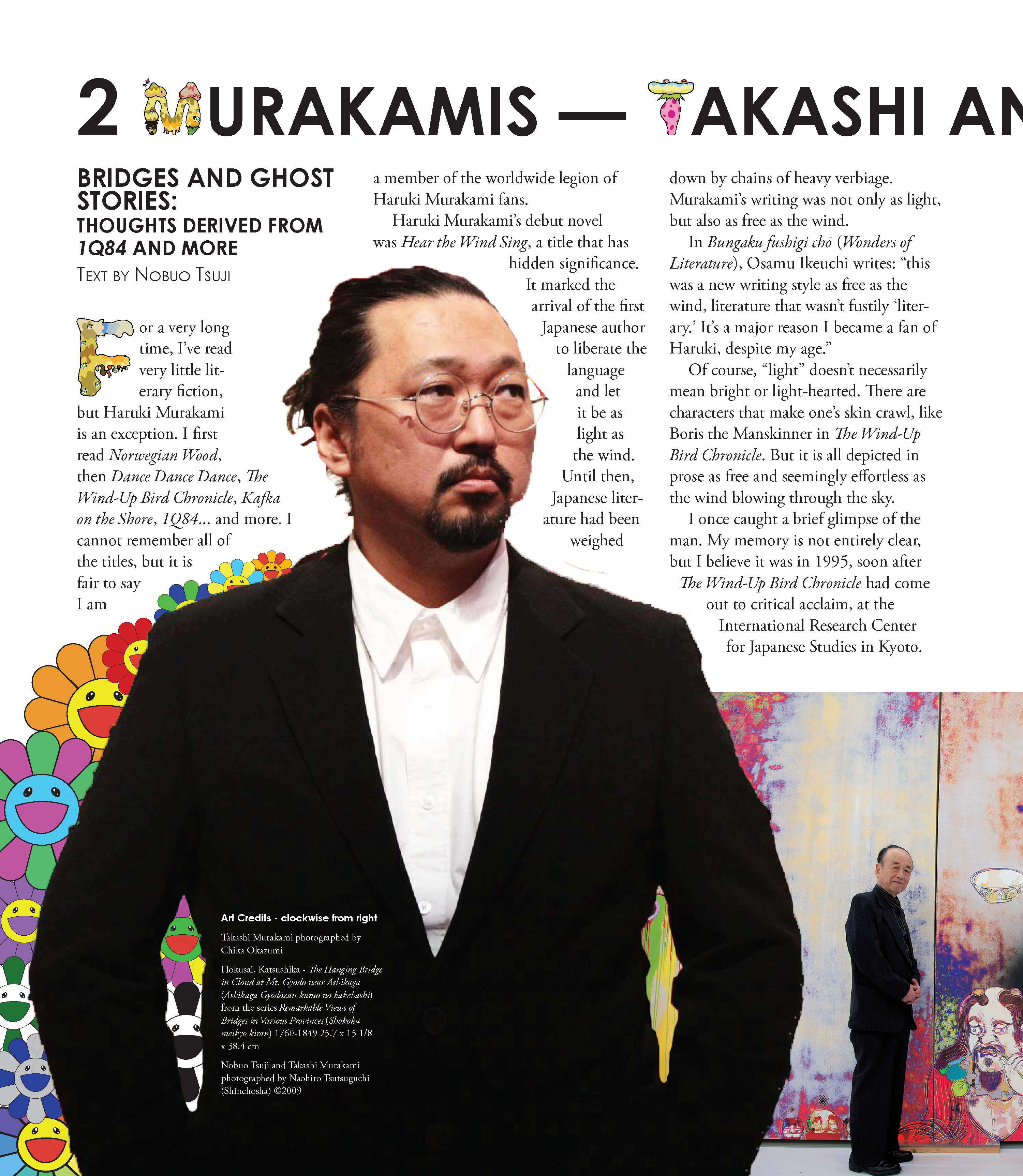
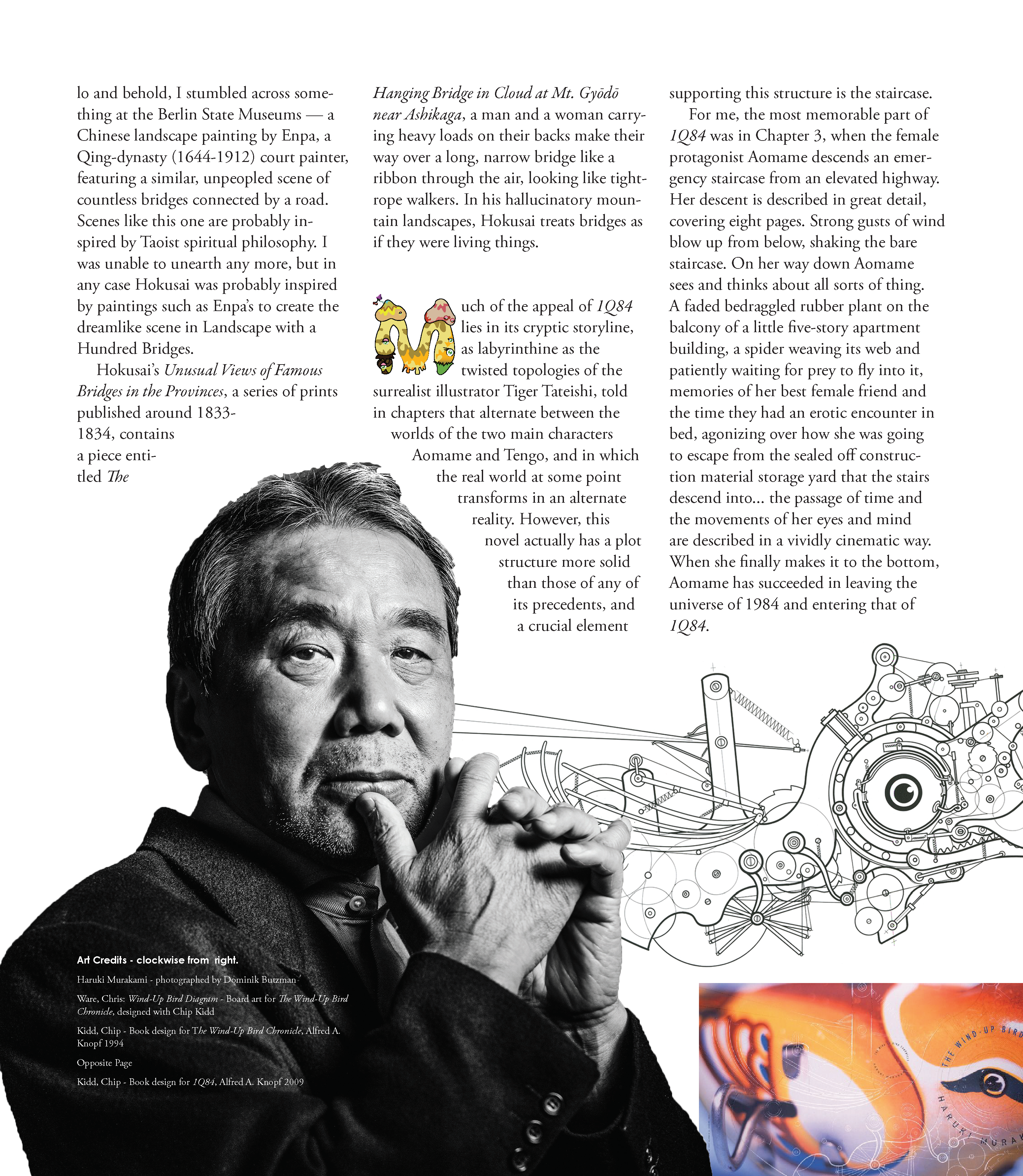
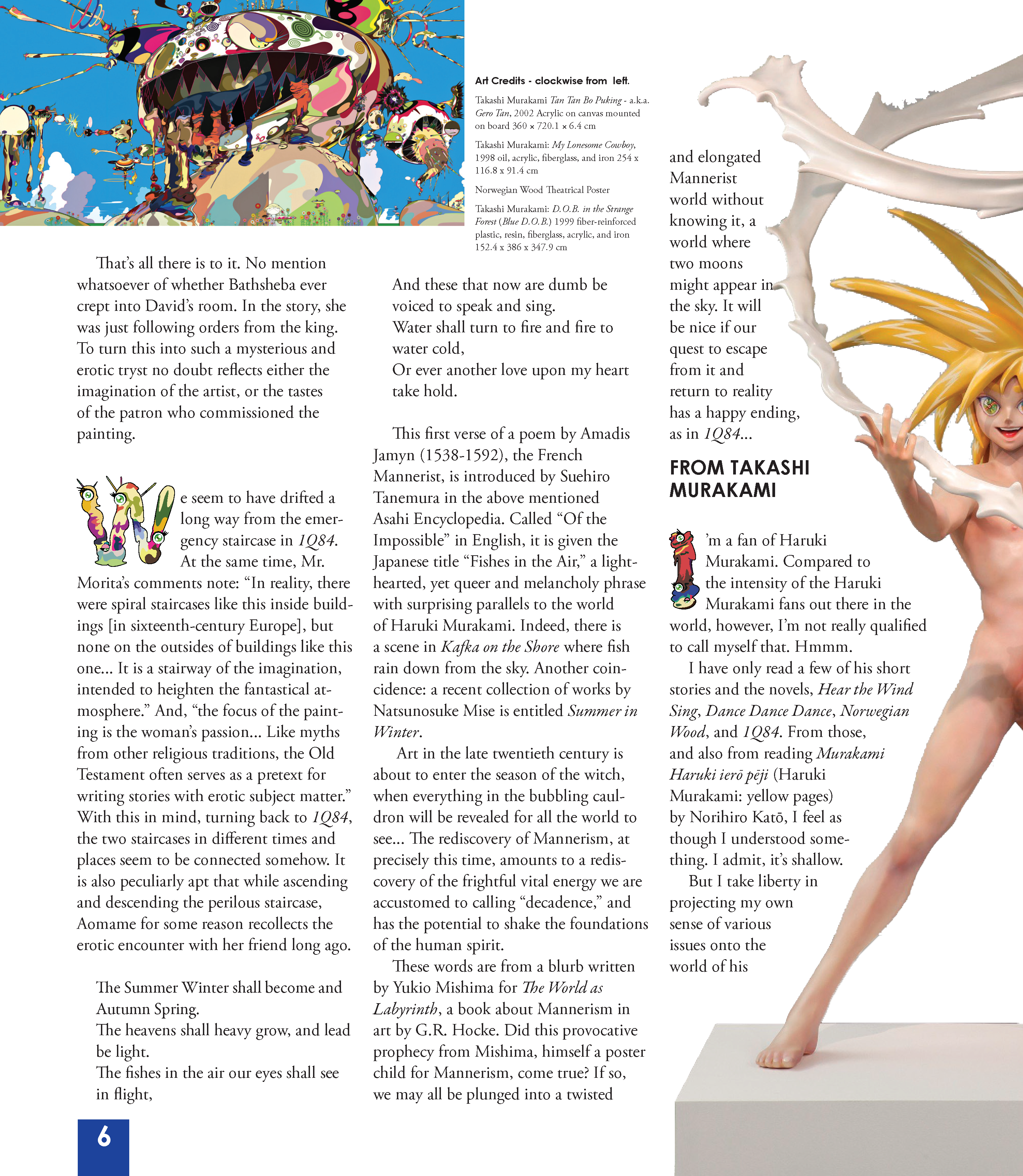
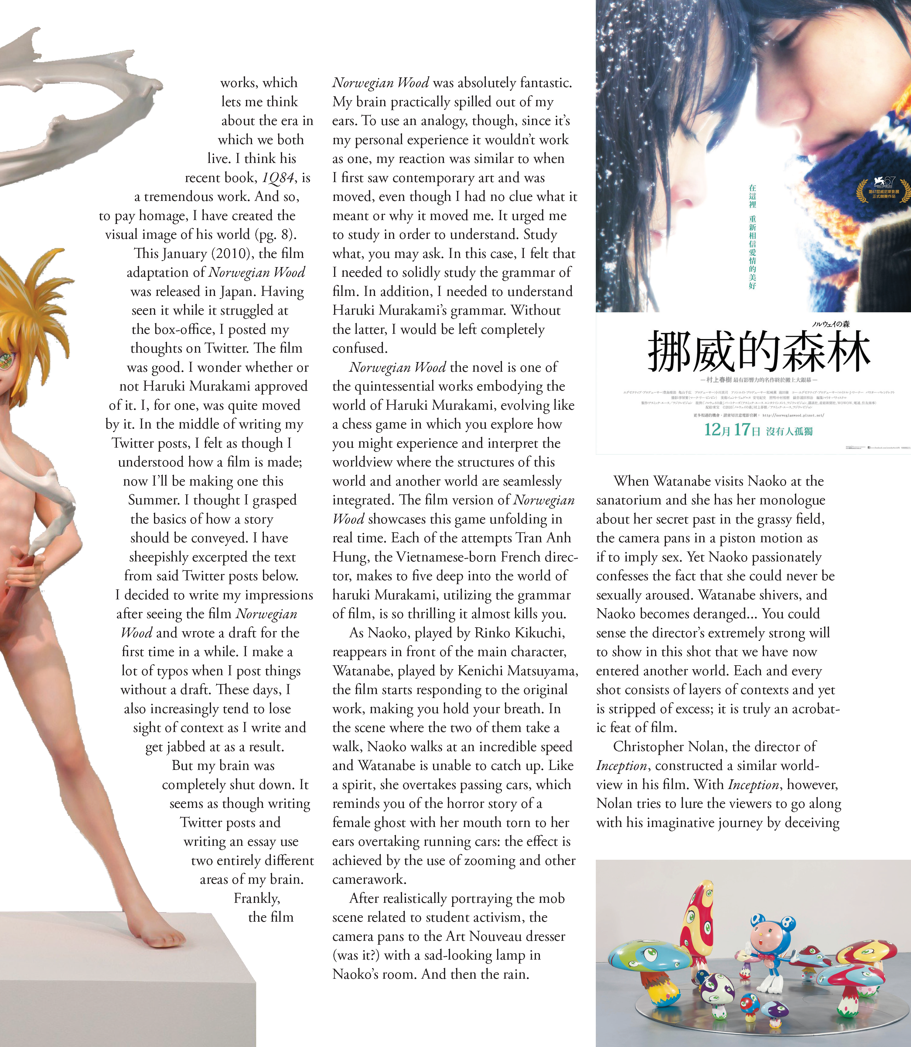
I chose to use a chapter from Battle Royale! Japanese Art History which collects English translations of exchanges between art historian Nobuo Tsuji and fine artist Takashi Murakami as my source text and chose a chapter where they challenge one another to engage with the work of my favourite novelist, Haruki Murakami, since it encompassed a range of my interests and gave me a lot of opportunities to play with images I love. From there, I decided I would juxtapose the visual excess of Takashi Murakami with the design sensibility of Haruki Murakami’s primary U.S. book designer, Chip Kidd, so for the spread dedicated to Haruki Murakami I used images from Kidd’s designs while for Murakami I chose more anarchic arrangements to speak to his penchant for Pop Art excess.
What was the most challenging aspect of the project?
Learning to set up paragraph styles and character styles and keeping them consistent was one major hurdle, but one it was fun to overcome. Setting images into the text without overburdening the reader was also a challenge.
What design problems did you solve?
With help from the class I found compromises to keep art credits out of the margins and with help from Professor Dodd managed to work in my custom Murakami letterforms which I principally traced from a design stencil created by Sonia López which I discovered on Behance.
Where did you find resources (text, images, fonts, colors)?
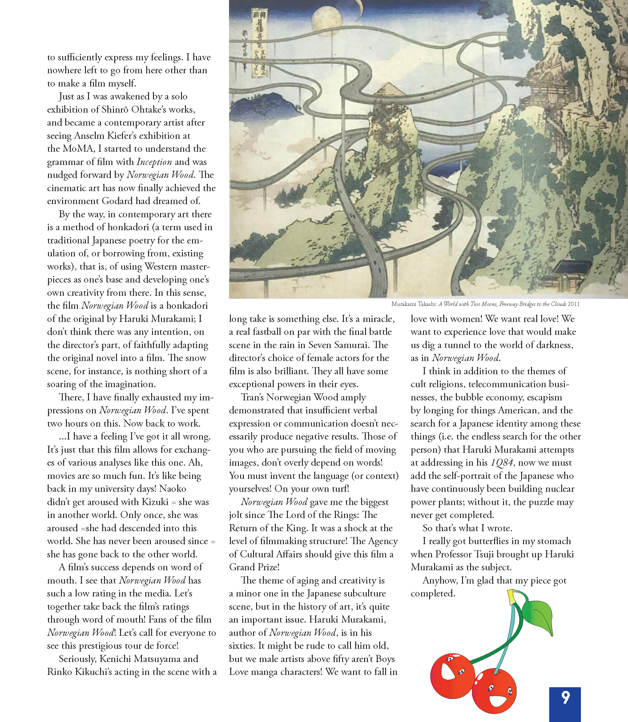
I found images using Google images and Behance. I also created some in Illustrator based on images from Google. The final image I had to source from my copy of the book and manipulate in photoshop to get it to look suitable on the page. Finally, I made the Murakami letters, as mentioned, in Illustrator, and converted all except the H into a working colour font based on Sonia López’s designs with flourishes of my own.
What fonts did you use and why?
I chose Century Gothic for its range of styles and similarity to the house font used by Takashi Murakami’s Kaikai Kiki Co. Ltd. As my header font and used Garamond for similar reasons for my body text. The Takashi Murakami inspired font I used for drop-caps and title embellishment because of the artist’s use of such fourishes.
Project Specifications
Trim size:10x11in
Bleed size:0.125 in
Number of pages:8
Color mode:CMYK
Spot colors:NA
Fonts:Century Gothic R,B,I,BI and Adobe Garamond Pro R,B,I Murakami Font (Incomplete Selection of Letterforms, designed by me in Illustrator)
Image formats:PsD, JPG, and PNG